Notes from migrating 24 years of blog posts from Wordpress to Ghost

As I mentioned in my previous post, it was no small task to migrate an old blog from one system to another. A few people asked how I did it, so I'm sharing some notes I wrote along the way.
Why leave Wordpress.com?
I've used Wordpress for over a decade, first on my own server running the open source packages but I got tired of constantly having to patch it and getting hacked a couple times when I didn't stay on top of it. I decided to give up and go to the hosted version at Wordpress.com, so I could skip dealing with constant security patches.
However, on the lower tier plans, you get a feature-limited version of Wordpress. You don't get any plugins. You don't get to upload Wordpress themes you find online. Unless you pay at least $40/month, you can only pick from a group of selected themes with limited CSS customization options.
Last Fall, I even tried to go back to my own server with a fresh install of of the latest open source copy of Wordpress. I found the export from Wordpress.com and then import to my own instance wasn't great. All my imported blog posts referenced images on Wordpress.com servers, and with thousands of entries, it would be impossible to rewrite all those old posts.
Eventually, Wordpress.com felt like flypaper to me as a user of it. I was stuck using it, and I couldn't move away. Features I wanted required plugins and higher costs. Trying to migrate from hosted Wordpress to my own copy of Wordpress was complicated and they're behind both products (shouldn't that make it seamless?).
I feel like moving between Blogger and Wordpress and Movable Type 15 years ago was pretty easy. You'd download a file, upload it to a new system, and boom, years of your work were now at the new place. It doesn't seem that easy any more.
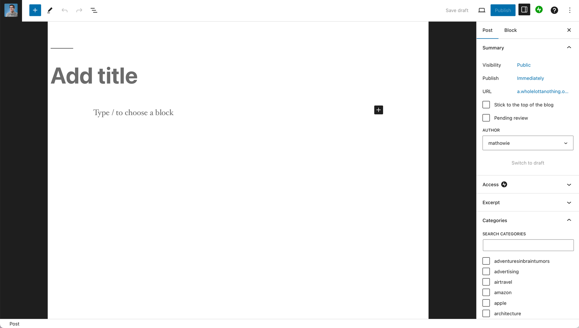
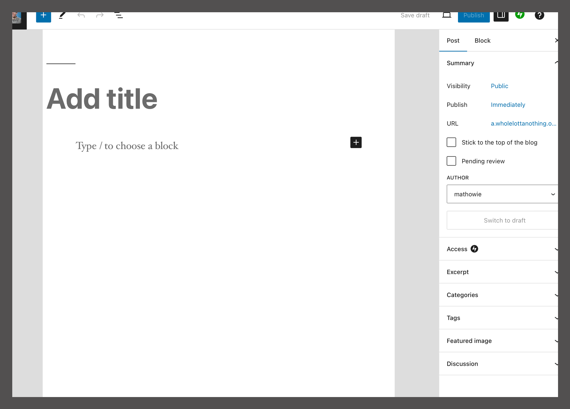
The final straw was something small and petty. About 3 weeks ago, the main editor on Wordpress.com suddenly had giant black letterbox margins. I checked my browser settings, and tested several different browsers to make sure it wasn't an errant browser plugin or javascript blocking but they all displayed it the same way.
This persisted for weeks and I tried to ignore it but it just looked broken, especially an interface I've been using for over a decade. I couldn't find anyone on Mastodon complaining about it too so I thought it was just me.
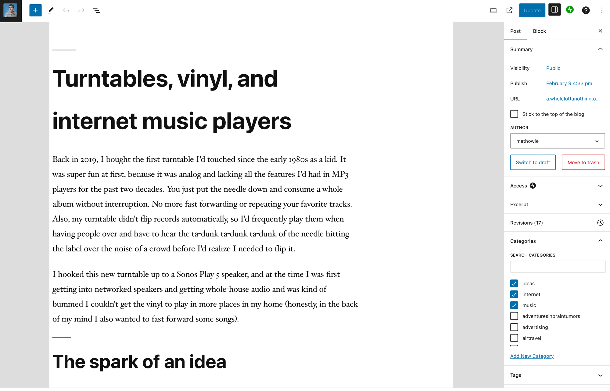
This week, the margins suddenly turned gray. So I guess this is expected behavior at Wordpress.com now? It still looks weird and broken, and I miss the old editor layout.
So I started seriously looking elsewhere.
Options
Squarespace is basically an e-commerce whole-site generator that dabbles a little bit in blogging. Wordpress.com increasingly seems like it's being built for sites and pages instead of blogs and posts. Medium feels like it's quickly turning into a walled garden.
About ten years ago, I tried out Ghost when it was new, but back then it was basically a Wordpress clone that required writing in Markdown. Now, it's more of a full-featured product. I also wanted to lean into their email features to go along with their blogging tools.
The good, the bad, and the ugly
I started by exporting my blog posts from Wordpress.com, which gave me a zip file containing two xml files that look like giant RSS files listing every post, one going back 6 years and another going from 6 years ago back to the year 2000. I have almost 3,500 previous posts but I didn't understand why Wordpress' export had to split it across two files. There might be a limit of maybe 16Mb per xml export file? It feels arbitrary when we have big computers with terabyte drives now. I mention these pesky details because it causes problems later on.
I downloaded my media (images/videos/etc) in a separate zip file from Wordpress as well, and it was pretty huge, on the order of several Gb.
I went into my new Ghost account, used their import/export settings, and uploaded my zip file from Wordpress, but despite Ghost telling me everything worked, it failed silently, without any error messages, but there were no posts added.
I contacted the support team at Ghost, and they gave me tips on how to DIY it myself using their command-line tools. After some configuration on my own Mac (I hadn't yet installed node or any dev tools so that took a bit), I got Ghost's XML Wordpress importer to work on my Wordpress export if I fed each XML file into it one at a time.
It's interesting how this works (because it's a bit convoluted) but once you run the importer, it loads every single post's URL from Wordpress, then runs a little scraper bot to grab all the images. In the end, Ghost writes out a new zip file of your Wordpress entires that contains all your images and audio and video files referenced in your posts, along with all the content of your posts.
The scraping takes a while, I set the Ghost tools to display progress with the verbose flag and for about 30-40 minutes, my terminal scrolled as the bot grabbed all my info one post after another.
Hilariously, my 2018-2024 archive was nearly a gigabyte in size. But my 2000-2018 archive was only one quarter of the size. The culprit? Phone photos are gigantic now, and my image directories from just my past few years of sporadic posting greatly outweighed the 18 years of previous posts!
After you run the command line tool, you'll find a new zip file containing all your content on your computer, and once I uploaded that into Ghost, all my posts appeared, with all the images, and galleries, and videos and it was actually kind of impressive.
Also Medium
I imported all my content from my Medium account as well (they offer Medium and Substack imports, then just generic importing for everything else). The Medium importer worked well, about the only bug I found was a giant animated GIF in one of my stories appears as a static frame image after import (probably a bug with Ghost's importer bot not grabbing the whole file).
Ghost vs Wordpress
Once I had all my content here on Ghost, I started to happily use their editor. It's really well designed and the editing UI feels like having my own personal copy of Medium.com.
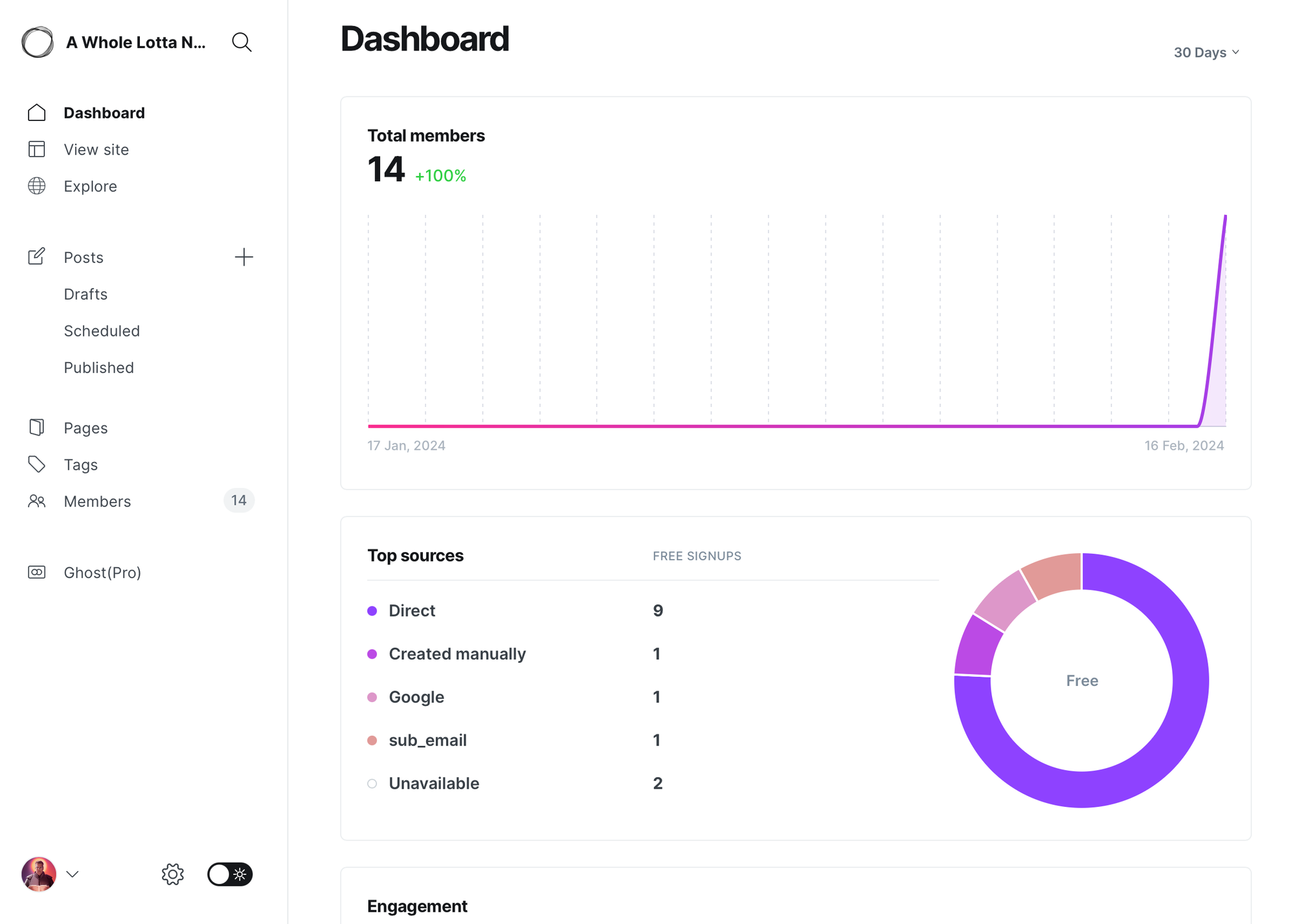
Let's look at my default dashboard in Ghost:
And this is my dashboard in Wordpress:
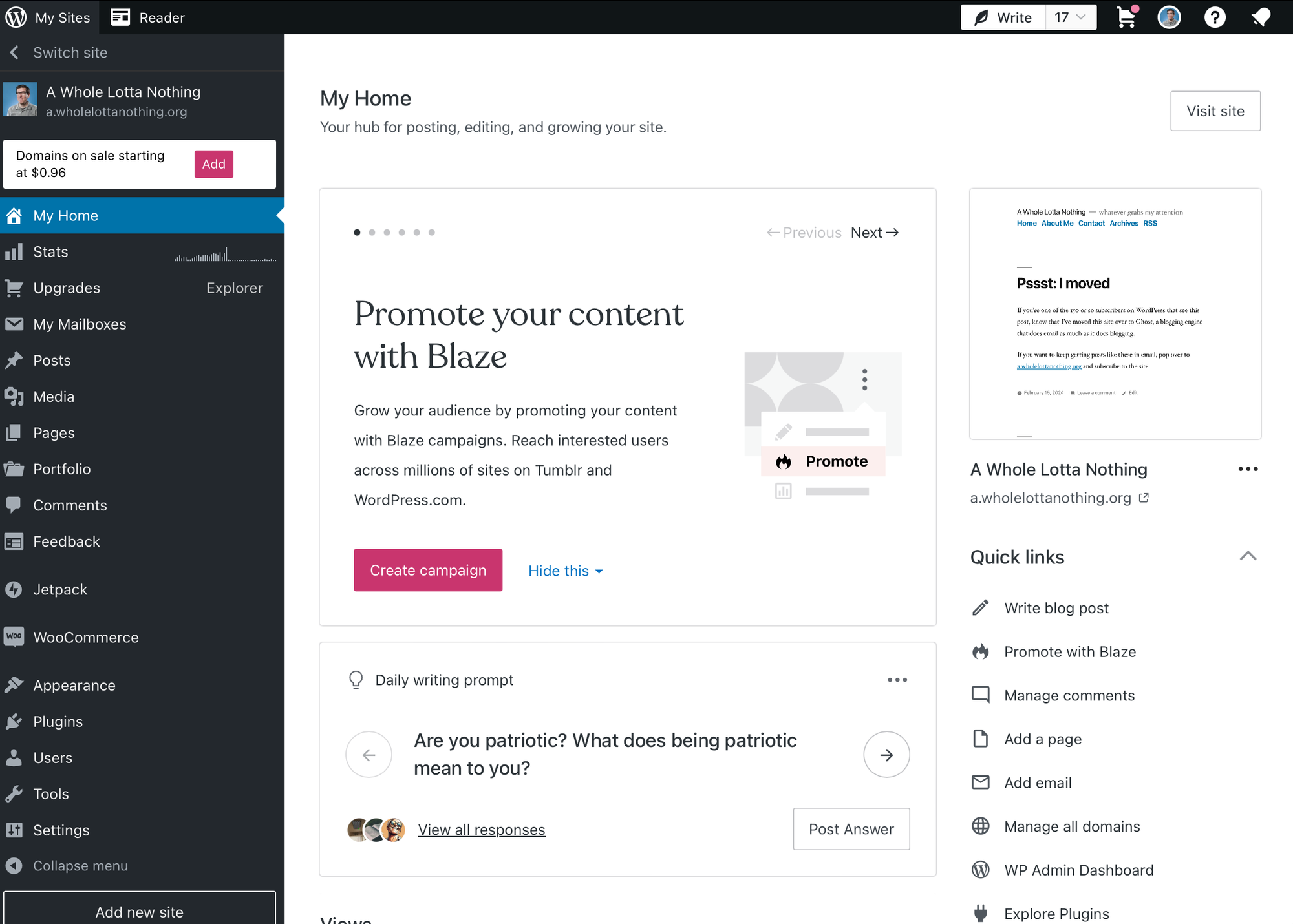
There's a hell of a lot going on in both, but the Ghost dashboard is pretty chill. You're greeted with quick stats and if look at the left sidebar it has about a dozen options but they're grouped by function, with good whitespace to make it easy to write new posts or edit your existing ones.
The Wordpress dashboard feels like it has a lot of promotions going all over, each demanding your attention. The left side navigation has dozens of options with no hierarchy. You might only access some of those features every few years and yet, the Plugins page (that I don't even have access to in Wordpress) is the same size as the Posts option to write a new entry.
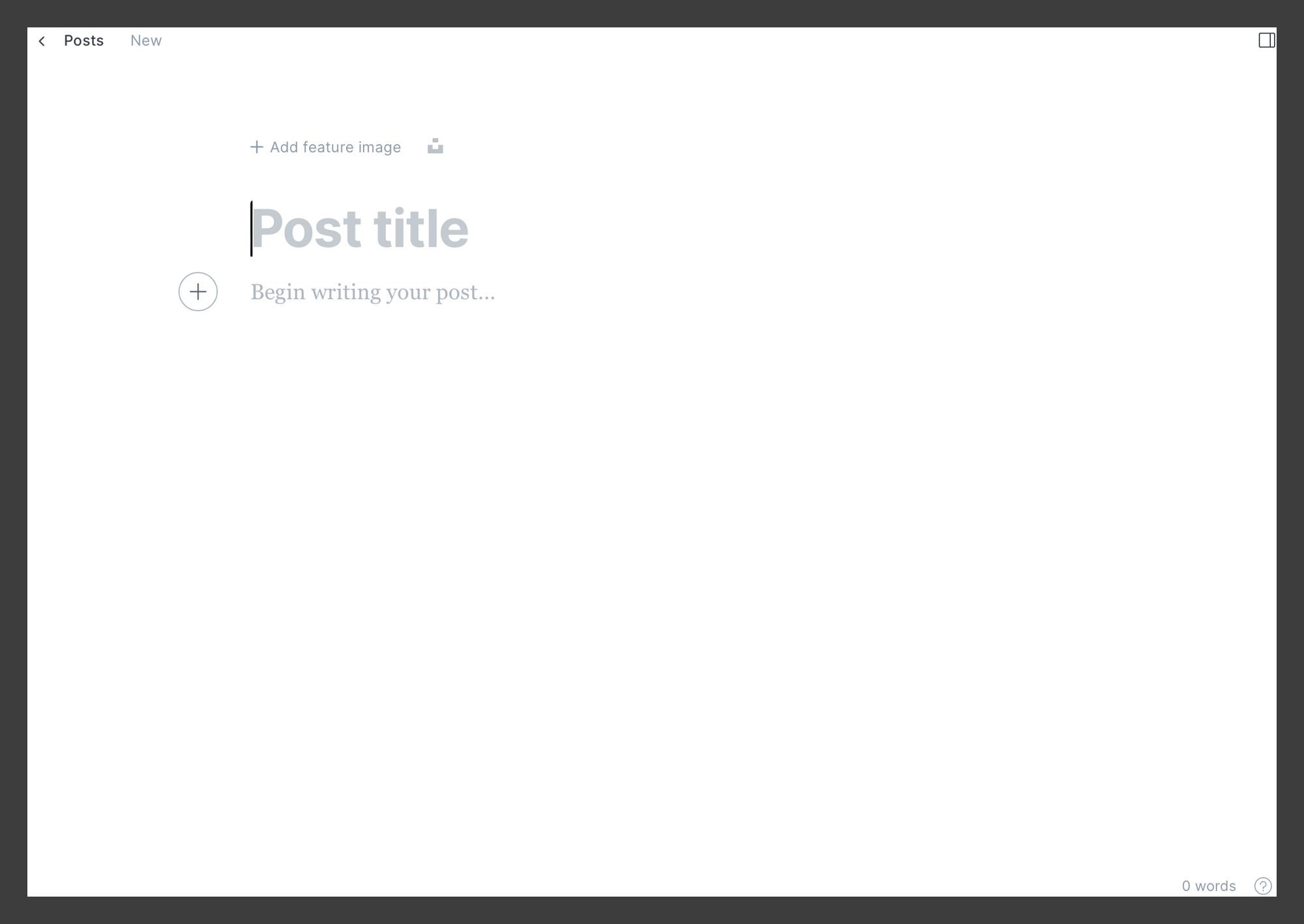
The Editor UI for both is much the same story. Here's Ghost, which basically blocks everything out and lets you concentrate on your post. Picking tags is hidden beneath an optional panel.
And here's Wordpress, where you get that weird letterboxed margin look, but also tons of metadata going down the side, including both categories and tags, which I never understood (also: categories are required, but they default to the unhelpful Uncategorized category, which, I dunno man, pick a lane and make everyone use tags or categories but not both?):
Themes!
One thing where Ghost feels modern and fresh but also lacking is their Themes. They're generally pretty good, all seem responsive and use the latest HTML/CSS techniques. But Ghost didn't have the 10 year head start Wordpress did, and there are way more themes for Wordpress numbering easily into the thousands.
Ghost templates definitely feel catered to certain tasks and certain sites. A lot of people want to build a newsletter archive with one, or something that looks like a magazine or newspaper. The "blogging" category of themes is one of their smaller options and after playing with the free options I've ponied up a few bucks to buy some more elaborate ones. Still, I've spent the last day tweaking templates because nothing quite hits right (rest assured this site might look every different in a few days, that's normal for moving to a new system).
Custom tweaks are a little clunky
Using Ghost Pro hosting, the way you interact with your template theme is a bit weird. You download a zip file of all the files and assets that make up your templates, unzip, then modify them in your own text editor, then re-zip up all the files and re-upload as your "new" theme. You also have a "routing" table in YAML that you have to also download, edit, then re-upload to make custom URLs and features work.
I understand the increased flexibility from using zip files, as you can make custom templates as new files and keep samples and references in your zip file, but on the other hand, every other blogging engine I've ever used in the past 20+ years usually had a "templates" section that let you edit inline, in your admin area. The routing table is a pretty short text file, it seems silly to have to download, edit, then re-upload just to add a single line of text.
Prognosis: I'm glad it's over
Moving my content was a 2-3 day process, and moving my domain to point here was another hassle that took several hours to get right. Building my own archives page that looked like I wanted took another chunk of time. I'm currently not stoked on how the front page of the site looks, but I'll continue tinkering on it this week.
Moving 3,500 entries that existed across half a dozen previous blogging engines was no small task, but now that it's done, I'm glad it's over and I'm really enjoying the peaceful, straightforward look and features of Ghost over the more chaotic and limited functionality of Wordpress. And I'm also stoked everyone can start reading this site via email if they like, or leave comments on posts (as long as you register a free account here first).
I hope this post helps anyone else considering a similar move and if you have any questions, hit me up in the comments below and I'll do my best to answer them.
Subscribe to our newsletter.
Be the first to know - subscribe today


