My rocky first 24hrs with the ᴡᴀᴛᴄʜ
I’m an insufferable asshole, and I’m here to complain about my brand new $350 luxury watch that so far hasn’t lived up to my insanely high expectations, which I am publishing here on Medium using my 5k iMac.
Setup wasn’t smooth. The watch app forcibly installed on everyone’s phone a few weeks back which I previously complained about on Twitter (my main beef is the lackluster design of the app icon for such a revolutionary new product) didn’t actually work in any promised automatic way. I had to pair the watch manually. Which took two tries. We fought wars for this?

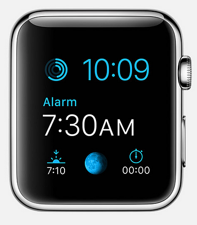
The included watch faces leave something to be desired. None of the ones with hands are great for fast recognition (for me), while the ones with the time as text either display too much or too little information.
The “Modular” face throws every useless piece of data in front of you during those first few moments you’ve got the watch and before you have any idea how to change anything. It is literally the worst first impression you can make. “Hey, your new expensive watch can display a dozen pieces of useless data, at once! Like this!” It took me a bit to figure out how to change faces, customize and simplify faces, and in the end I have a tolerable watchface I’m ok with but I wish I could swap the size/location of the time and date. Leaving a customer using a new product with tepid compromise is the new “it just works”.
Ten watchfaces aren’t enough watchfaces. Are more coming? Pebble has a watchface store with 10,000 hideous options but about 20 really good ones that make wading through the other 9,980 worth it. Apple seemed to say there should only be ten watch faces and we should be thankful for them even though one is Mickey Mouse which is kind of like saying we get 9 faces.
My phone has been downloading dozens of updates of apps made for the watch for weeks, but after getting the watch on my wrist, I realized none of those apps automatically added to the watch, but recent (meaning: as I was setting up the watch) app updates were automatically on the watch like my bank, which I don’t want on my watch. Five minutes later I learned the older apps had to be manually enabled one-by-one. Ugh. Again with the tedium. Additionally, apps asked if I wanted “Glances” enabled too, but in this first half-hour of watch ownership, I didn’t know what “Glances” were yet so I guessed and enabled it on apps I like most. I hope it doesn’t do awful things that I will have to disable one-by-one.
Most third-party watch apps were designed in an emulator by someone that didn’t own an Apple watch or use their own app while wearing their own Apple watch in a variety of everyday contexts. Consequently, some apps have too many interactions while others offer just one or two tiny features of their app. I’m sure new versions of watch apps will get better but for now they’re hit and miss.
Instagram tries to replicate the entire app on a tiny screen. You can see a feed of images, then recent activity on your own photos. It’s not a great screen to enjoy images, but it is nice you can see recent mentions. As a jerk who lives for any strokes of his ego, monitoring my new hearts and faves in every app is a part-time job I actually enjoy doing.
Twitter on the other hand only gives you two options: read your timeline five tweets at a time (who here likes the tedium of hitting “read more” every 10 seconds? Then you’ll love this.) or you can look at Top Trends (popular hashtags). Is there a single person on this planet that cares about and reads global trending hashtags? Have you ever actually clicked on those trending hashtags? You never click it twice is all I can tell you. I mean great, they got rid of the Discover tab in the iPhone app, but now I guess it’s on my expensive wrist jewelry? If Twitter’s watch app was only notifications of favorites and mentions it would be great since that’s the first place jerks like me look on my phone or desktop.
My BMW’s i3 watch app is completely inoperable. Do I even need to bother unpacking that previous sentence?

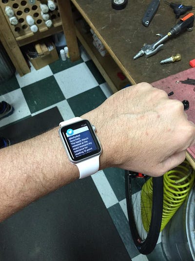
Notifications seem to have very little rhyme or reason. Instagram will tell me two friends liked a photo, but my phone’s lock screen will show about 20 more Instagram likes in the same timeframe. Instagram notifications won’t go away until I tap through two screens to dismiss the items individually. Twitter lets me know about once an hour that I got a new favorite, while my phone will show me getting dozens more. I got a nice haptic tap for a new text once on my wrist, but not a few hours earlier when I got other texts. Notifications themselves are formatted in unique ways for every app, with no standards. Some are quite wordy and reminded me now that I’m over 40, I’m nearing the time to get bifocals/progressive lenses because it’s tough to read teeny tiny text on a small screen a couple feet away from your eyes. I’m always squinting to read things more than a sentence long on my watch, which many notifications feature.
I tested out the watch in two situations I thought a great deal about over the past few months: SPORTS and MOVIES.
I put on my $160 Hoka One One shoes and my $130 Backbeat FIT bluetooth headphones and strapped my $500 iPhone 6+ to my upper arm before putting my $350 watch on my wrist to track a 2 mile run. I launched two apps: Apple’s default exercise app — after telling it I was doing an Outdoor Run, it began a countdown and told me when to start running — and then Strava, my favorite third-party exercise tracker that uses your phone to determine when you are actually moving and didn’t start timing until I was actually running. The Apple Exercise app’s default screen showed my elapsed time and current time of day. These weren’t helpful while running. I wanted to know how far I’d run and how fast. Late in the run I noticed the 3px tall dots at the bottom of the watchface indicating other screens, but of course the two pieces of data I wanted were on two different screens. Strava defaults to a bike ride, with no clear way to change it to a run. Later I found out a Force Tap lets you change modes, but instead I recorded it as a ride I had to edit later on my phone into a run.
I left the house with iTunes Radio playing the Pure Pop channel, and when I wanted to skip a song, I had to tap the crown to wake the watch, tap again to get to the “bubbles” home screen, drag my fingertip around to find the music icon, tap that, then tap a tiny arrow key to change songs. I did this all while running in a straight line, looking down, and covered in sweat. I could see a lot of opportunities for mistakes I narrowly avoided in that five-step process.
Also during the run I was getting tired of terrible Pure Pop and wanted to hear Classic Rock but the Music app offers playlists and albums and artists and songs, but no iTunes Radio station lists, which I pay iTunes Match to hear commercial-free and is the first default option on the phone and desktop but is unavailable on the watch. Consistency!
Wearing this watch in a movie theater is not a great idea. Any time you shift in your seat, your watch awakens. When you get a notification — if you look at it — you’ll learn some are small fonts on black backgrounds and not that bad while others have notifications with big white icons and light gray backgrounds that light up a room. My favorite unknown feature was the Apple Activity app informing me halfway into a movie with a forceful haptic jolt and message demanding I needed to stand for one minute out of every hour to remain healthy and I should do so right now because I hadn’t stopped sitting since the movie began. Also, when the watch comes to life unexpectedly in a dark theater, or you know, any other location you might be in that might be dark, there’s no way to instantly darken it besides covering the watch face with your other hand which you should hope is free to cover your expensive wrist computer.
The watch repurposes existing phone features and it’s not always great. The love notes and drawings/taps feature is keyed off your phone’s favorites list in your phone’s phone app. My phone favorites are my wife, two close friends I contact often, and my brother, whom I call every so often and usually only for urgent family matters. He is on my favorites to save time digging for his number halfway through my contacts every few months when I need to contact him, not because he’s a favorite per se.
So there is my brother every time I hit the button below the crown. Forever.
You must understand, I love my brother, he was ok growing up with, though he was an older hit-you-on-the-arm-for-flinching kind of brother, and I mostly filter all family stuff through him since I’m estranged from my disabled father that he lives near and gives me updates on. My father is estranged because he orchestrated a secret wedding between him and his nurse in the weeks after my mom died and this is now three years later and I’ve never met her and I don’t really intend to and last week my dad referred to her as “your stepmother” in an email to me even though she’s closer to my age than his. Why does every new piece of software and hardware remind me that my mom passed away quickly and unexpectedly a few years ago, leaving everything in her wake in chaos? Developers: please stop doing that. I have already had to remind Facebook about it and it’s starting to get tedious.
Don’t get me wrong, I’m glad I bought it and I’m sure I’ll love it in a couple months after I figure out every hidden swipe and setting that removes every frustration I described here. This is a good first attempt at breaking into an entirely new category and I commend Apple for taking such big public risks on new things, but being version 1 is just that: it’s very version 1. Version 2 of third-party apps will certainly improve once developers get to live with their apps on their wrists for a while and version 2 of the watch itself will likely be great, but for now expect your first day to be… problematic.
FURTHER READING: An actually useful, great simple guide to tweaking and using and thriving with an Apple Watch is elsewhere on Medium, and I’ll be taking much of the advice from that guide to improve my experience with my own watch.
Subscribe to get posts via email
Be the first to know - subscribe today


