The first 48 hours with an iPhone X
It’s been a number of years since I got a new iPhone on launch day. It’s exciting to get it on day one but you definitely feel like a beta…
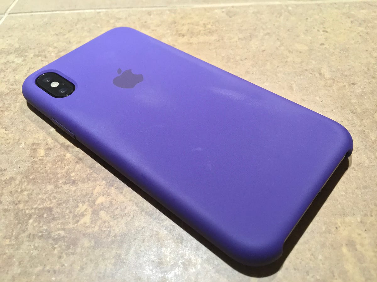
It’s been a number of years since I got a new iPhone on launch day. It’s exciting to get it on day one but you definitely feel like a beta tester, figuring out quirks and bugs along with every other early adopter.

The great things
The most impressive thing about the iPhone X is the screen that’s diagonally larger than my previous iPhone 7+, but it’s about the size of a non-plus iPhone. Apple is a company that strives for simplicity, and I don’t like when their product line expands for different sizes. It was dumb for them to produce both 11" and 13" Macbook Airs when ideally, you’d stuff a 13" screen in the 11" case by removing the giant bezel (which is what the 12" Macbook basically accomplished).
I love that they achieved the upsides of the larger phone in a smaller package. I’ve used the plus-sized phone since the 6 came out and it’s a real treat to carry something smaller.
The notch is easy to ignore, since no video I tried crossed under it (even 2.35:1 widescreen movies don’t stretch to reach it), and most apps I use have been updated to avoid it (losing the battery % number because of the notch was annoying though).
I haven’t put the camera through the paces yet, but I can tell it’s better at low-light shots and the new effects look pretty good. Even though I love emoji, Animoji looked like a cheap gimmick for the keynote demos but it’s way cooler than I thought.
The migration from my old phone to my new one was the smoothest to date. You literally just put them next to each other and the X took all my settings and began restoring from backup within minutes.
The not-so-great things
I’ve tried several resets of the Face ID feature with and without my glasses in different lighting, but over the first couple days, the facial recognition works best when I’m wearing glasses in a lit room. In the dark, my face only unlocks the phone if I sit straight up and the room isn’t completely dark.
Maybe it’ll get better as software updates roll out, but the biggest gripe I have is that I can’t unlock my phone while laying on a pillow in bed. There’s no fallback Touch ID, so I put in my passcode, but the screen has an automatic 30 second timeout, so if you’re reading a book in the Kindle app, your phone may go dark and lock up while you’re reading, which was super frustrating.
I hear you saying “Matt, why not extend the default timeout on the screen to a minute or two?” but that reduces your phone’s security. If I ever leave it in public somewhere, I’d be effectively doubling or quadrupling the time a thief can infiltrate my phone.
That’s Face ID—super handy when it works, but combines your most important security layer with what appears to be a pure convenience feature, which is kinda disturbing.
Learning all the new gestures wasn’t too bad, most of them are intuitive and though I’m having to remember how to get to certain screens, I’m re-learning them quickly.
Even though initial setup was easy, be sure to turn off cellular backup for the Photos app (it defaults to on), or you might blow through 60Gb of mobile bandwidth like I did last year after getting a new phone.
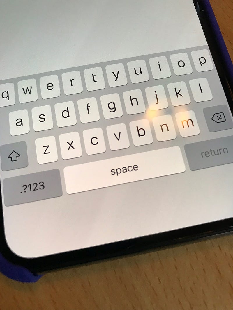
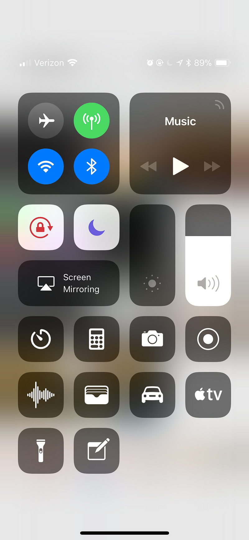
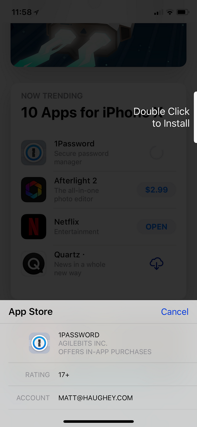
WTF UI
A quick tour of WTF moments when using the phone the first day:


Parting shot
Overall, it really does feel like the future of mobile phones. The lack of buttons, the huge screen, the mostly intuitive gestures, and face unlocking all combine for an impressive package. I hope the kinks get worked out, because it feels just steps away from being a perfect future.


