Every Mastodon iOS app scratches an itch: a brief tour of various clients
Last week, I wrote a gentle intro to Mastodon for the Zapier* blog. I aimed it at regular people that hadn't yet delved into everything it takes to leave Twitter for the federated network, offering tips on how it works and how to get started using it.
After writing the piece, I realized it could be helpful to do a quick tour of the different iOS mastodon clients I've tested and used on my phone.
It's a fun time to be an early user of a social network, and especially one with good API support, because it means literally anyone can make their own Mastodon client that looks, acts, and behaves how they use the app.
Features of Mastodon vs. client support
Which iOS Mastodon client works best for your exact needs depends on how you use it. For me, my most important features of Mastodon are:
- Easy as possible to read my timeline
- Finding and reading my mentions
- Refreshing my timeline to "now" needs to be obvious with easy controls to backtrack to older posts
- Finding things I marked as a favorite later on (rare, but I do it to find things I wanted to come back to)
- Occasionally looking at my local instance's timeline and the search/explore option to find posts I might have missed
- I don't typically use DMs in Mastodon (they're not really secure) but it would be nice to access them apart from notifications
- I rarely boost/RT so I don't want too much screen taken up or gestures favoring that over marking a favorite
Many clients prioritize one or more aspects over the others, but thankfully there are so many options that chances are you'll find one that fits your particular needs.
So with that, here's a quick screenshot tour.
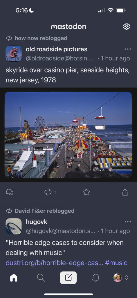
Mastodon (official iPhone client)
Pros:
- The official client excels at the display of your main timeline: good fonts, subtle use of whitespace, and great small icons below
- Explore button surfaces good posts gaining traction, not a bad use of an algorithm
Cons:
- Notifications tab shows each and every interaction on its own line, so it's a lot of scrolling
- No easy way to find my instance timeline
- No support for editing even though it's the official app and the 4.0 server supports editing your posts and replies (you have to open your mastodon account in a safari browser instead to edit)
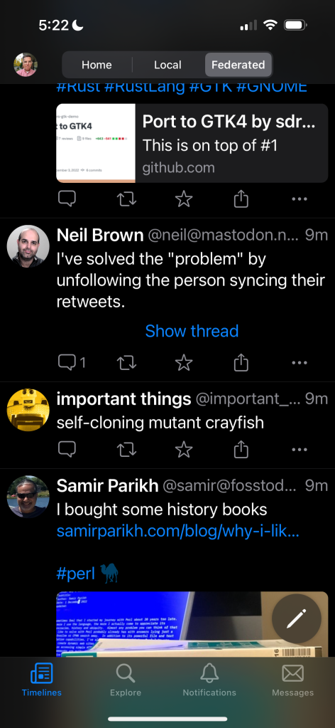
Metatext
Pros:
- Great feature at the top to let you switch between timelines
- Separated DMs into its own view, which I find better than the actual mastodon website on my desktop
- The timeline refreshes to "now" quite easily
- Has a "show thread" link when it knows a post has multiple replies from the same author
- Explore tab shows you trending hashtags with number of mentions
Cons:
- Notifications are still spelled out for each interaction, making it a long scroll
- The developer of it recently posted about their health issues, pausing further development of the app unless a new maintainer comes along
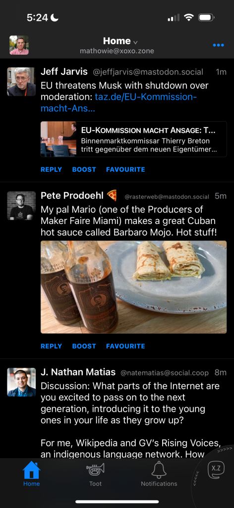
Toot!
Pros:
- Easy switching to local instance and between accounts on the lower right
- App understands threading and replies, lets you follow all responses to a post like it's a subway map
Cons:
- Tiny fonts don't respect my font settings across iOS
- Not stoked they use text for reply/boost/favorite instead of small icons
- No search/explore top level nav
- Costs a few bucks, which is fine if it did everything I needed
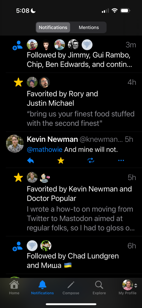
Tusker
Pros:
- The only client that collapses favorites, boosts, and follows from multiple folks on just one line of your timeline when they occur in a row
- Good explore/search page offering links to all sorts of options
- The posting interface is nice and offers all the options on a single screen (polls, images, etc)
- It's currently in beta, but improving steadily with releases once every week or two
Cons:
- Refreshing the timeline to the most recent post is kind of a pain, you have to scroll up to the top several times and wait for a "Jump to Present" button to pop up, which will take you to "now"
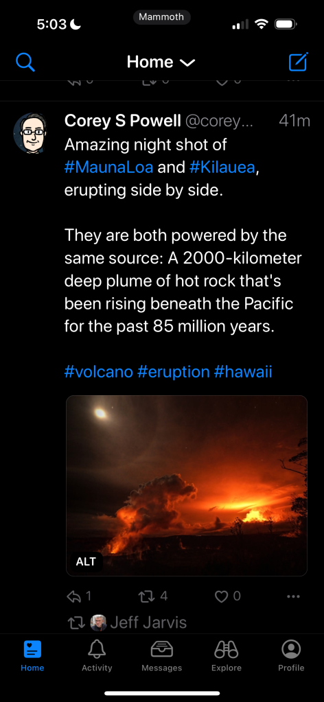
Mammoth
Pros:
- Really nice reading interface
- Messages tab that separates out DMs
- Explore tab is really well done, even shows photos with trending topics
- Great timeline controls, easy to jump to "now" at the top with a tap, shows you how many posts are in between now and your current view with a counter on the right side
- Also easy to switch timelines from the drop-down control at the top
- Beta, but several versions come out each week, the most actively developing option for a client that I've used
Cons:
- Notifications tab puts every interaction on its own line, doesn't group them at all
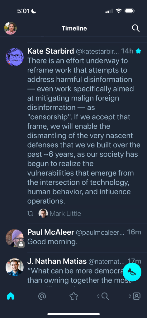
Ivory

Pros:
- Slick timeline reading interface
- Reply/favorite controls are hidden behind a tap to make the reading UI as streamlined as possible
- I personally like the favorites icon shortcut, it's the only client that offers it as a default view
- Good polished feel throughout, feels very much like a "real" app
Cons:
- The notifications tab is ONLY replies/mentions from others. You don't get notified about any new followers, boosts, or favorites. This makes using this app full-time a dealbreaker for me, as I want to know how people are liking the things I post
- I opened it once for the first time in a day or two and had no way of jumping to "now", and had to scroll up through 1200 posts (great for completists, but I found it kinda annoying)
- Beta, closed to new testers, no indication just yet of how long until it's available to the public
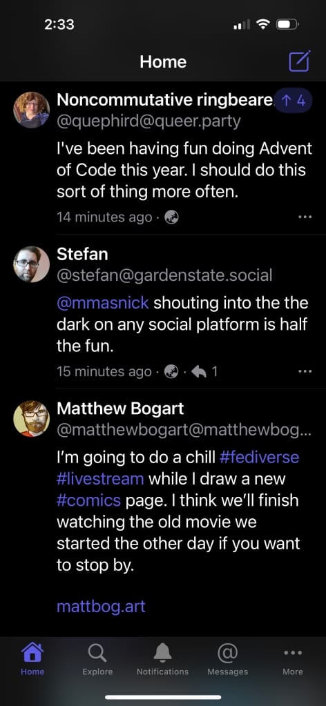
Mastoot
Pros:
- Clean reading UI
- Fast updating of my timeline to now
- Messages tab for DMs
Cons:
- Adding a favorite or boost to a post is behind the ... option at the end of a post, so it requires at least two taps to accomplish vs. 1 tap in every other client
- Notifications aren't grouped, so every interaction takes up space
My wishlist for future Mastodon clients
I currently switch between using Tusker or Mammoth full time, as Tusker has the best Notifications tab and posting UI for me, while Mammoth has a nicer reading interface. I'm also trying Ivory out too, but the lack of notification detail is a dealbreaker.
My dream client for Mastodon would:
- be flexible enough to let me specify which icons I want as shortcuts at the bottom of the app. Let me specify I want a messages tab if I am using DMs (though DMs are kinda scary in Mastodon so I rarely use them), and if I want to see my favorites, let me put the list there. Let me turn off stuff I don't use, and add views I use often.
- The notifications page on Tusker should be copied by every other app including the Mastodon web interface you use on a desktop. Yes, it's a lot like how Twitter does it, but it's the most efficient use of space.
- Jumping to the most recent post in your timeline is weird and different on every client app. Sometimes it's easy and it's a tap up top to jump to now. Most often though, apps require you scroll up several times before it presents itself as an option. I understand people don't want to accidentally "lose" their place in timeline reading, but it feels like most clients cater too much towards letting you see every single old post first.
- I know editing a post is a recent addition in Mastodon server 4.0, but it would be nice if more iOS client apps could support it. Currently I open mastodon in a safari browser on my phone if I need to fix a typo (update: I've since learned in the detail view of your own posts, you can edit a post in Mammoth).
- Client apps should understand threading and show you when a post and/or reply is in response to something and when it has more posts before/after it.
- I hope app designers and developers remember to go easy on the hidden UI features in swipes or taps. I know it's tempting to hide lots of features behind a double tap or swipe right/left, but I'll never know the feature exists if I can't see it in the UI.
- Don't forget to respect people's device-wide font settings, and put a great deal of effort into making reading the timeline easy as it possibly can be, with only a bare minimum of UI clutter.
* I'm writing for Zapier on a freelance basis so expect to see more posts over there in the future, here's my author page on their blog in case you want to follow it
Subscribe to our newsletter.
Be the first to know - subscribe today


