Don’t obscure UI with alerts
A public note to the Gmail iOS design team

I love Gmail and the Gmail iOS app. The introduction of tabs genuinely changed my life for the better by greatly reducing anxiety in my life. Still, these days I get annoyed by the Gmail app on my phone several times a day, and it feels like something that could be fixed. Here’s the problem:
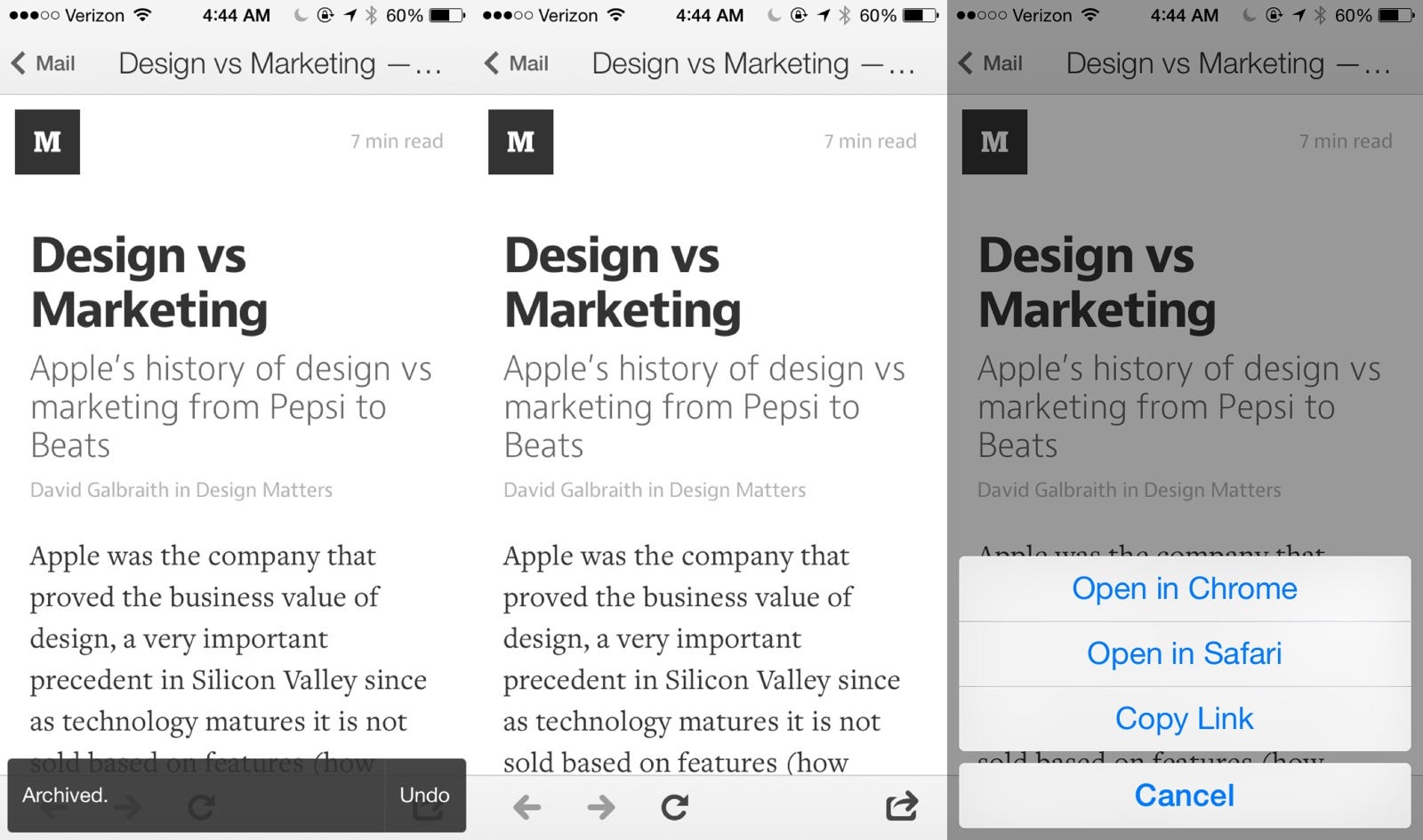
When you archive messages in the Gmail app, a small semi-transparent alert shows up along the bottom, and when you’re flying through your inbox, archiving like mad, it’s there for a while. I get a lot of system messages auto-emailed to me, things from my server telling me to click something to approve it or click to respond on my own website, but Gmail launches its own browser within the app, which I have to click the little lower-right box-with-an-arrow icon to go to Safari to complete.
The problem is the “Archived. Undo” banner is displayed over the app’s UI element for opening a link in Safari. It stays there for about five seconds before it fades out, and I run into this problem dozens of times a day and it drives me bonkers.
Solutions
A solution isn’t as easy as it seems, moving it above the bottom row UI of the embedded browser would mean the alert wouldn’t obscure the mobile web view, but would look weird and floating about 200px higher than it should in a normal Gmail messages list. Moving the alert to the top would obscure some parts of websites in that pane as well as cover up the Search bar functionality in the messages view.
The best solution would be forcing a clearing of the alert whenever a link in email is clicked that launches the internal web view. That way, the web view UI is never obscured.