Skate to where the puck is going to be, not where it has been
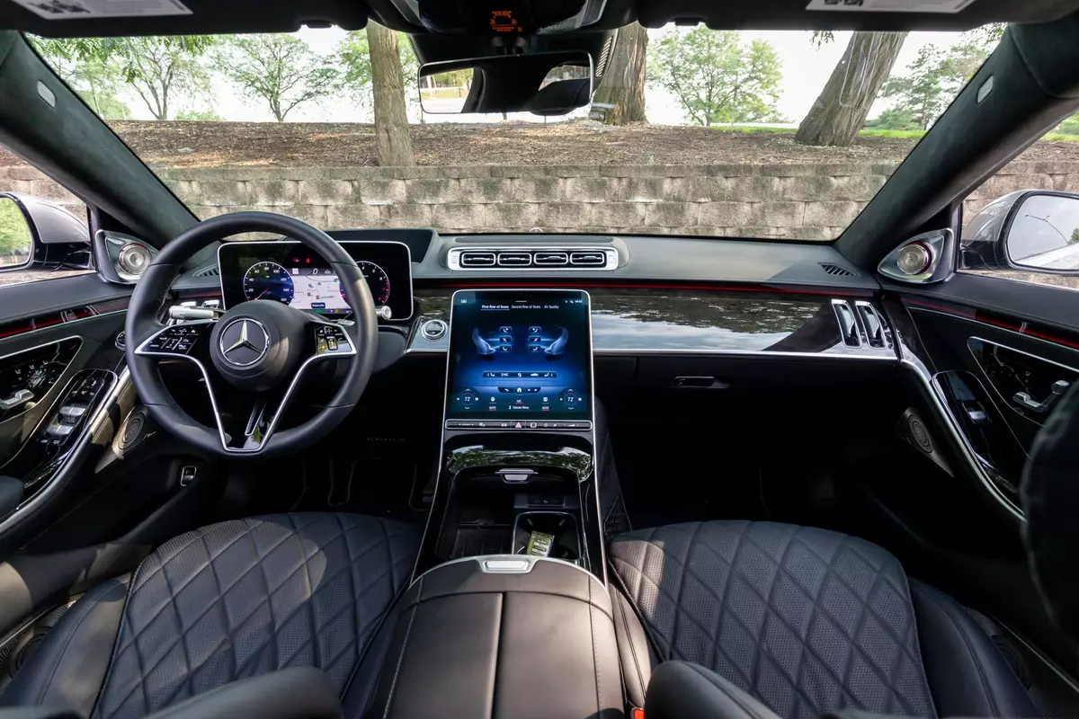
Here's a thing I can't stop noticing in new cars: when the iPad came out in early 2010, it took the world by storm and subsequently, when the Tesla Model S debuted in 2012, it had what seemed like a very forward-thinking futuristic dashboard that was mostly one giant touch panel display very similar to an iPad, and allowed for touch zooming and scrolling like an iPad.
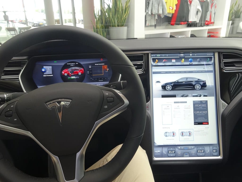
People were amazed and it immediately drew everyone to Teslas. The early reviews were mostly positive across the board. I rode in one for the first time around 2014 and I thought it was kind of cool.
But I quickly noticed most Tesla owners I knew and rode with just set the screen to a default view, glanced at their maps occasionally and controlled music using their steering wheel buttons, but generally they didn't seem to be fans of using the screen for controlling the heat and AC and other features buried in it.
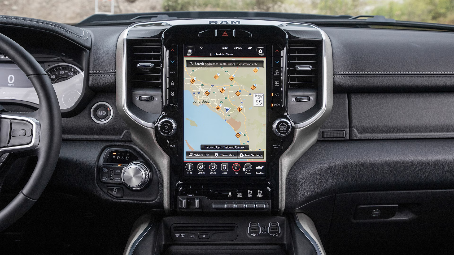
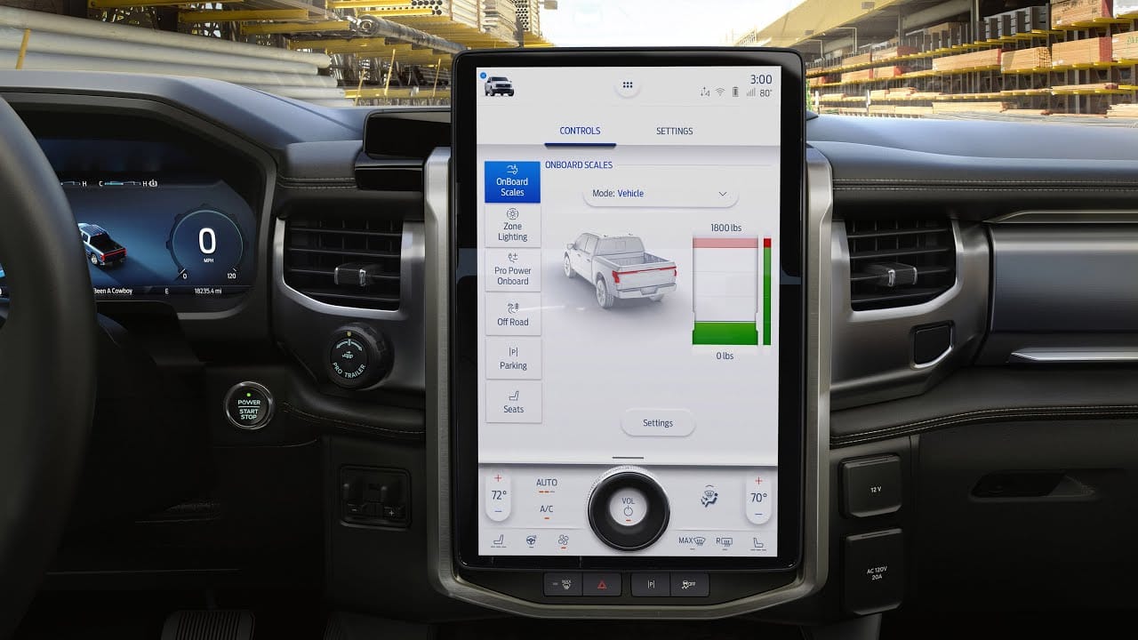
A few years years later, I started noticing the highest end luxury lines of full sized trucks from Dodge/RAM and Ford started to mimic this kind of display.
Here's a recent RAM dash:
And here's the top of the line Ford Lightning F150 EV dash:
So what's wrong with this kind of layout?
I've retrofitted several old cars with modern CarPlay screens and what I can tell you from using modern dashboards built for screens versus older dashboards not designed around a big touchscreen is that they work best when they're very high up on the dash.
When I put a CarPlay unit in a 2003 Jetta, it was down below heat/AC vents and cup holders and right about in the center of the dash, vertically speaking, just behind the gearshift. It was awkward to glance away from the road and downwards and I barely interacted with the screen, mostly using audio cues to guide me and steering wheel controls to control volume and fast forward through songs.
The best CarPlay screens are very high up on the dash, usually near the top, and that's where the most important information should reside. Using a touchscreen to control your heater or heated seats from the bottom of a tall screen sucks, and it also sucks to put any part of a screen below your line of sight, taking your eyes effectively off the road.
There's also the anatomical angle. Here's what our eyes look like in our heads:

Our eyes can dart back and forth to look out of big windshields, and I'm going on 35 years of driving cars and looking side to side feels natural. Looking down from the road feels unnatural.
The funny thing is, even Tesla realized this and by 2021, they replaced the dashboard design in their Model S to align with their other models. The S dash screen looks like this now:
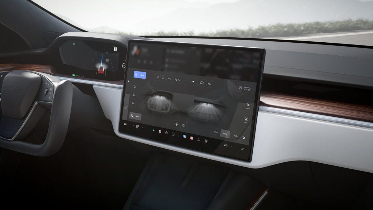
Unfortunately, they've added even more controls to the touchscreen, but at least now it's higher up on the dash within your line of sight and it's horizontal, like the eyes on our heads.
So it's funny to me when any new car company releases a vehicle still pushing vertical screens. Here's what Volvo's newest EV brand Polestar does for CarPlay in their latest models:
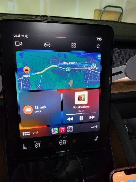
I've rented a couple Polestar 2 cars in the past year and I have to say I'm impressed that they reformat the CarPlay display to better fit a vertical layout, and the most important things I need to see are high up on the screen. But still, the heater and seat controls are at the bottom, in a not-so-great spot.
It's ironic since Volvo is a company famous for promoting car safety and they put a ton of tech into their cars now to prevent accidents, especially ones with pedestrians. And yet, they do this with their dashboard and have for years across their entire product line. My spouse's 2020 Volvo XC60 has a long vertical screen with too many controls on the bottom.
Another funny thing I've noticed is that if you buy the "stripped" work truck version of the Ford Lightning F150 EV, you get a small screen that looks much more useful in day-to-day driving and would be one I greatly prefer:
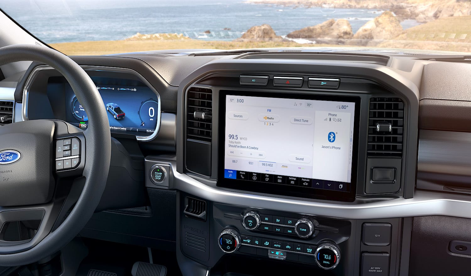
Love the actual hardware knobs below to control temps and airflow too.
So what's the solution?
I follow a lot of new car news and read reviews closely and test drive a bunch myself. One of best dash layouts for modern vehicles that support modern devices right now that I've seen in the wild is the new Jeep Wrangler 2024+ models with an updated dash that looks like this:
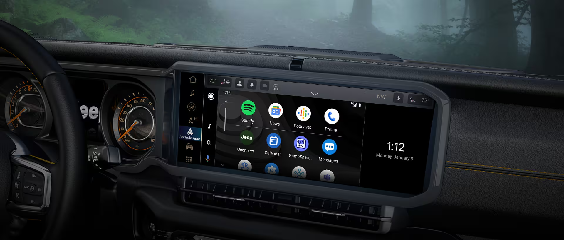
It's kinda short, only about 5" tall, but over 12" wide. It's a layout akin to how our eyes are laid out in our heads and it lets you display a TON of info on a single short but wide screen
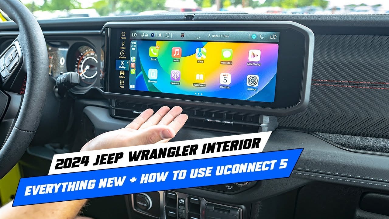
Jeep keeps heating and AC controls below with real physical knobs and buttons you can use without having to look at them and I also like how the screen doesn't extend above the dash and block any of your line of sight to the road. There are a ton of icons displayed in CarPlay in this configuration, way more than I typically see in other cars.
I sincerely hope this is the design direction going forward that other car companies try to emulate.
I will say it's possible to go too far. The newest Toyotas don't use vertical screens but they're putting 14" wide displays in their trucks that are so tall they block a bit of visibility above the dash, which I think is also a big no-no:
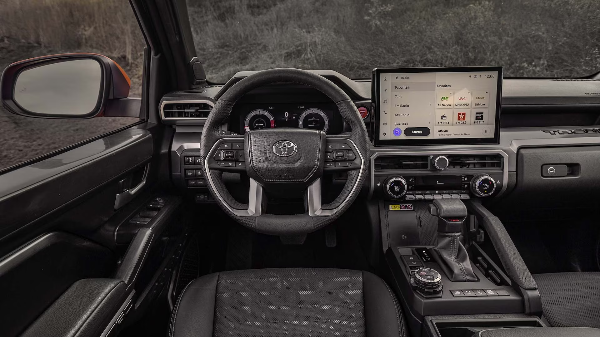
Anyway, my point is this: when you see vertical touchscreen dash layouts in new vehicles, those car companies are still following trends that go back to 2010 & 2012. The company that started it all changed course and abandoned the design years ago yet to this day many other manufacturers insist on skating to where the puck already was, even in 2024.
Subscribe to our newsletter.
Be the first to know - subscribe today

