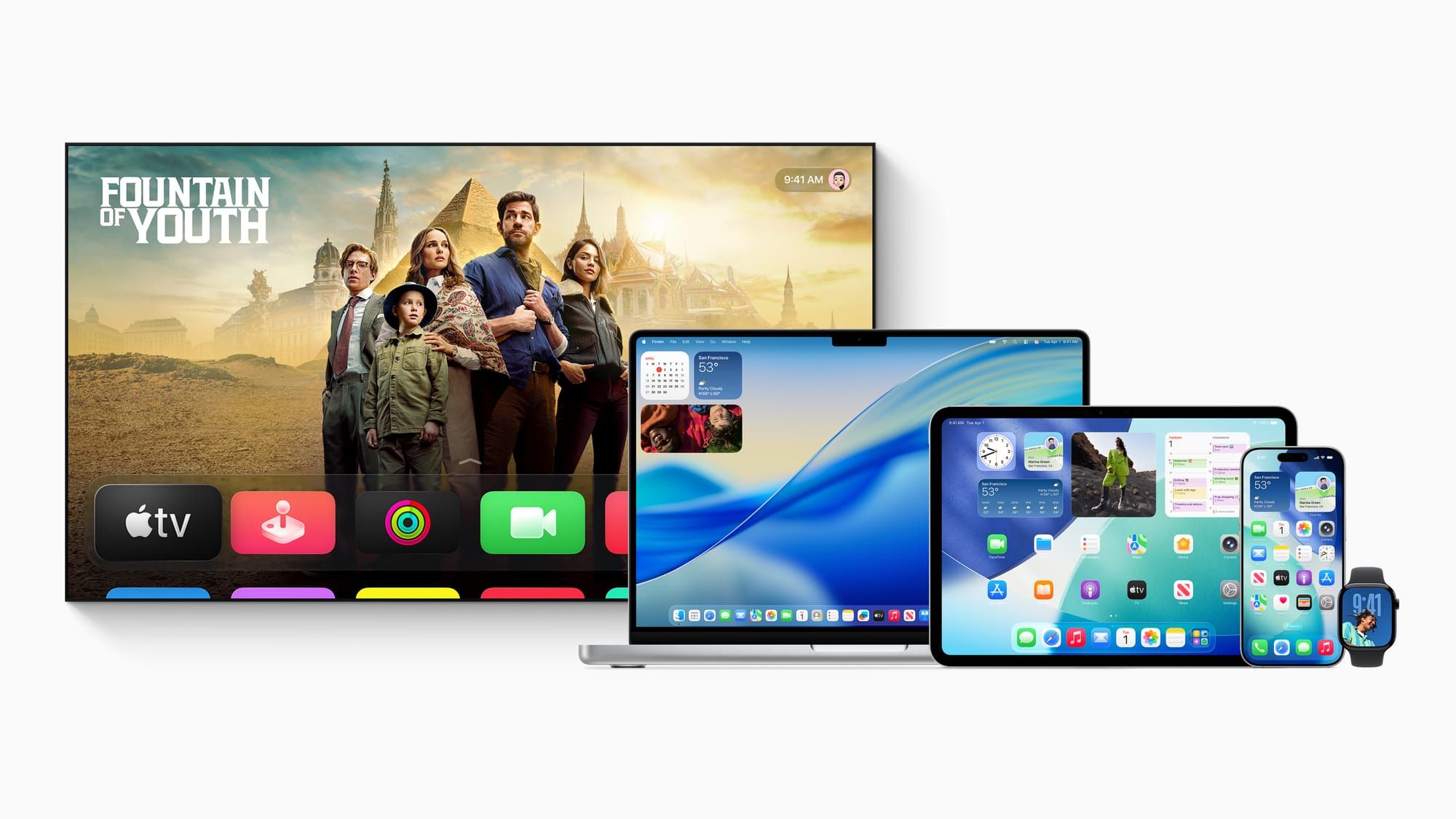
One month of using iOS/MacOS developer builds

Every June, Apple shows off new features coming to their devices at WWDC, but it was only a couple years ago when I realized I was no longer working at a big company with security protocols that prohibited beta software, so I could install them on day one. So I started taking the plunge and using the new developer builds months before they get released to the public to get an early look at new features.
Caveat: I know that running early release software risks everything on my devices and I have backups, but be warned your phone and computer WILL be less stable, might lock up from time to time and might need to be restarted.
What follows are my initial impressions, one month in while using new OS software on all my Apple hardware, including problems and highlights of things to come.
iOS26 (iPhone and iPad)
The new "liquid glass" look comes off as fun at first, but legibility was a struggle on the first beta. I'm on the second beta now, and they've fixed some contrast issues and I suspect they'll fix most of them before the final public release in October hits phones.
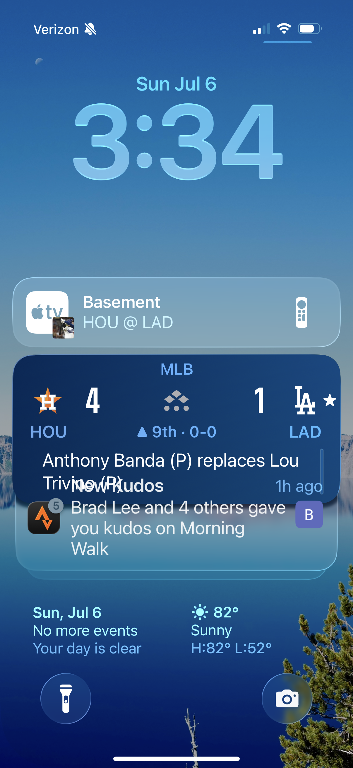
The biggest issue seems to be text overflowing in the lock screen, as notifications flop text over one another making them unreadable. It continues in the second beta release.
The iOS Safari browser has gone through a pretty significant redesign in how it handles multiple windows and you'll have to hunt around for a view of all your tabs, but that's mostly because iOS26 is stuffing a lot of toolbar buttons into a little menu marked off with a tiny … icon. You get used to looking for it in every app when you can't find something.
Battery life on my phone is pretty abysmal now, but that's probably because battery life optimizations are the last things to go into a new OS release. I seem to have to charge my phone about twice as often as pre-beta days.
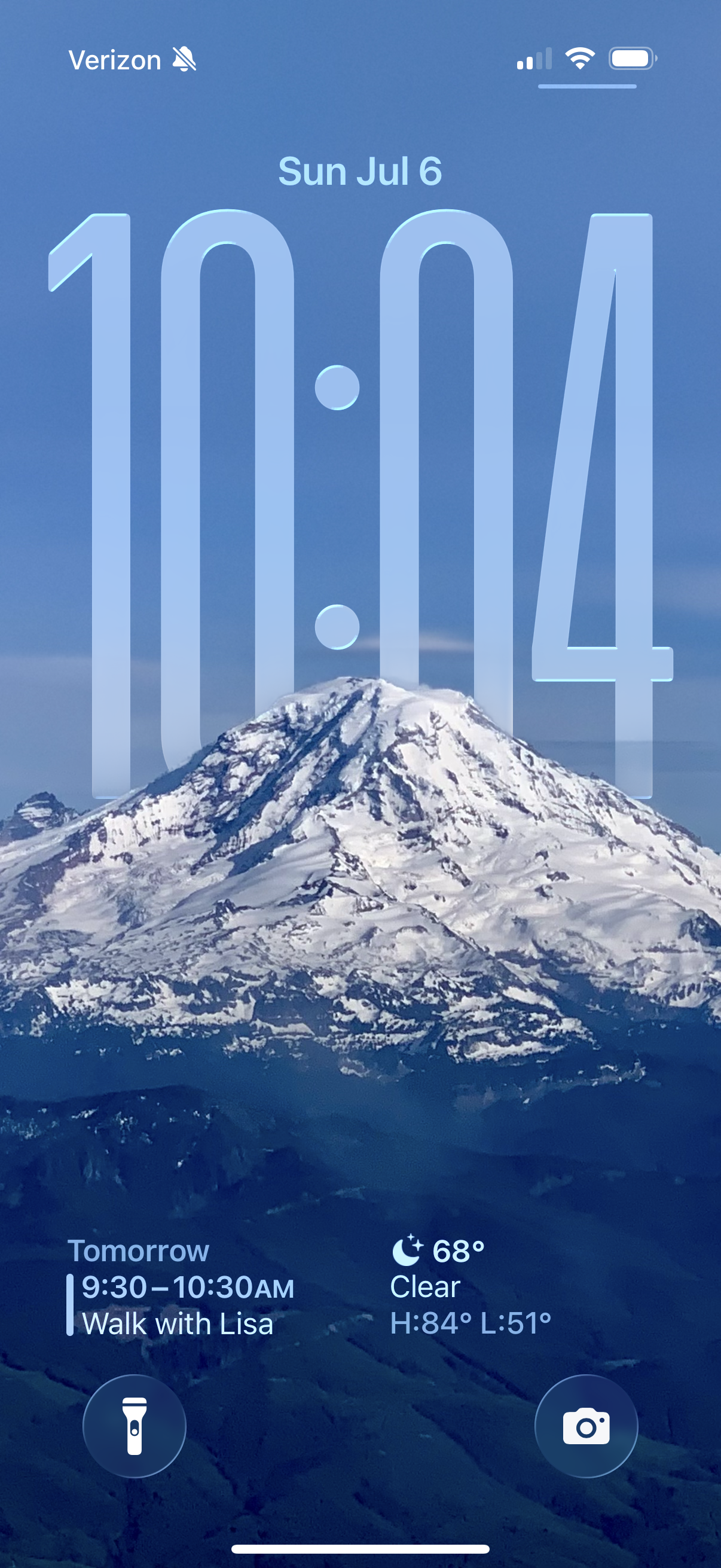
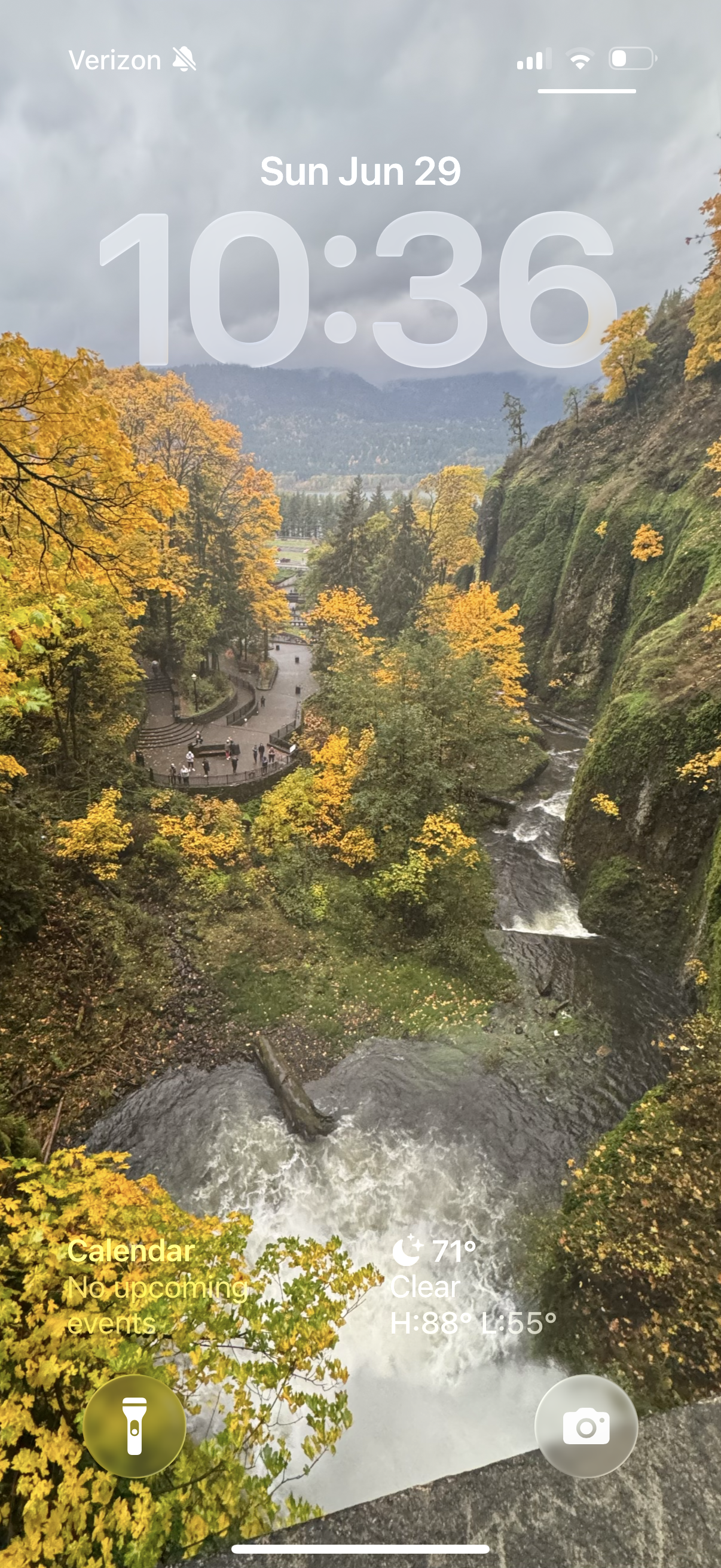
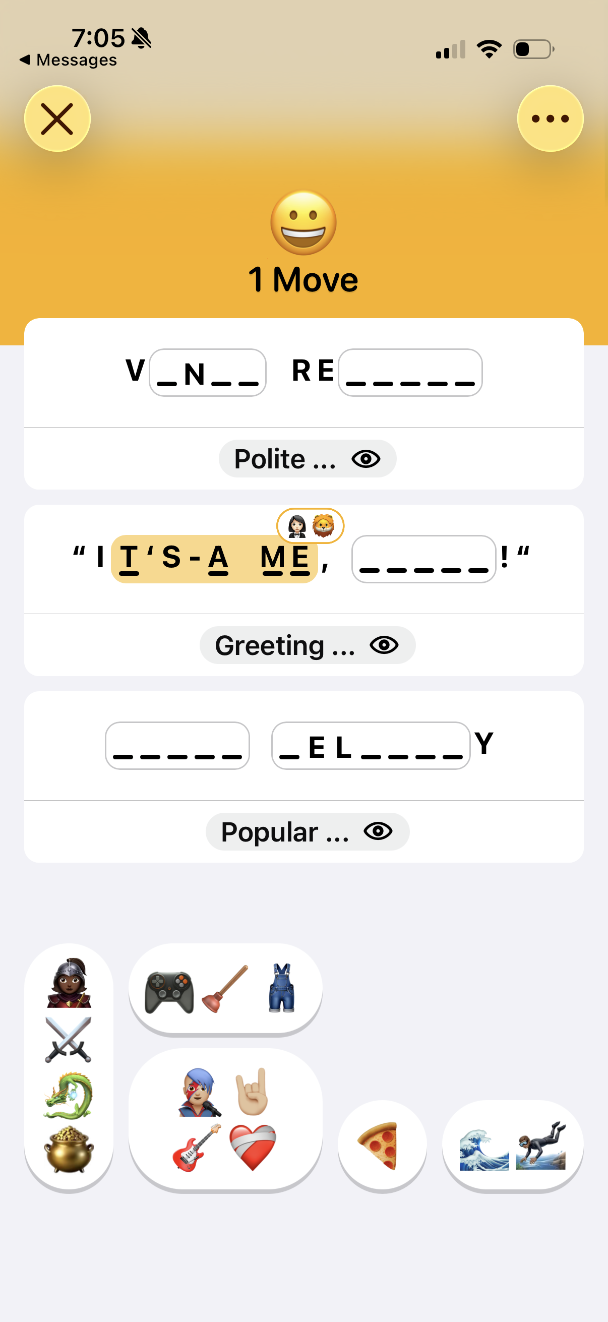
There are some fun aspects, the lock screen pulling nature photos from your own photo roll is actually quite impressive. The new emoji word-guessing game in News is fun too.
On my iPad running iOS26, I enabled the new multiple window interface and it really does feel a lot more like a desktop than a phone. One of my biggest gripes on trying to use a iPad as a real work tool was it was too hard to switch between apps or grab info from multiple windows to combine into others, but the new iPad OS looks to fix a lot of those problems. I bet with a real mouse and a keyboard I could finally get some real work done on an iPad in ways I couldn't before. To date, I've always used my iPad in a mono-tasking way because that's how the interface was presented to users. With the upcoming changes, it really feels more like a full blown desktop OS.
MacOS
The "liquid glass" interface is more subtle on a Mac, it mostly reminds me of the throwback "Aqua" interface of MacOS 10 in the early days. Stability has been good so far, with no real issues with the beta crashing apps or the OS.
So far my biggest nitpick is how Safari handles your tab bar. In previous releases, tabs you're not currently viewing would appear as greyed out, making it pretty obvious which tab was "live". For some reason, they switched it to putting an underline on all dormant tabs with the active one having no underline.
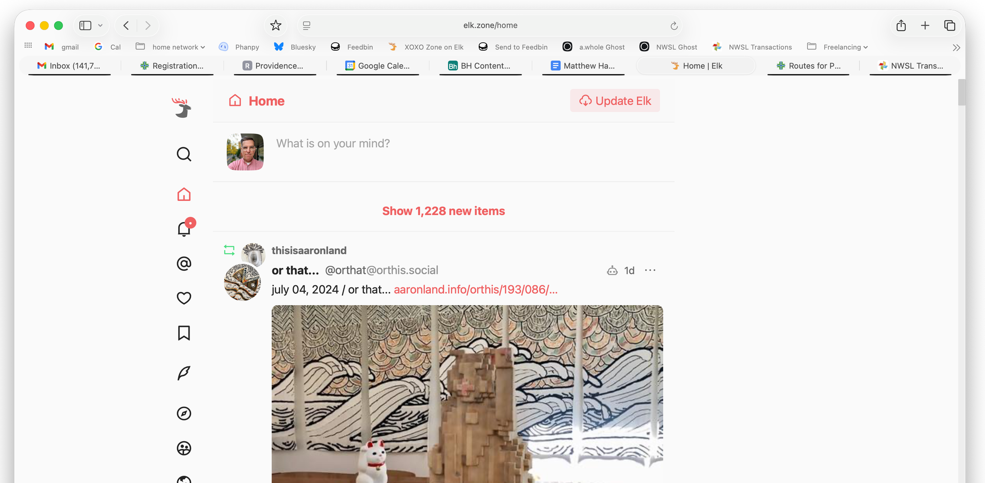
Look at the horizontal display of tabs in the screenshot above. Is it super obvious the "Home | Elk" tab is the one currently being viewed? I keep finding the opposite, as my eyes are drawn to the underlines automatically, as they seem to grab more attention than a simple plain tab.
This feels like one of the interface missteps that show up in new betas and I really hope they revert this before the final release around October.
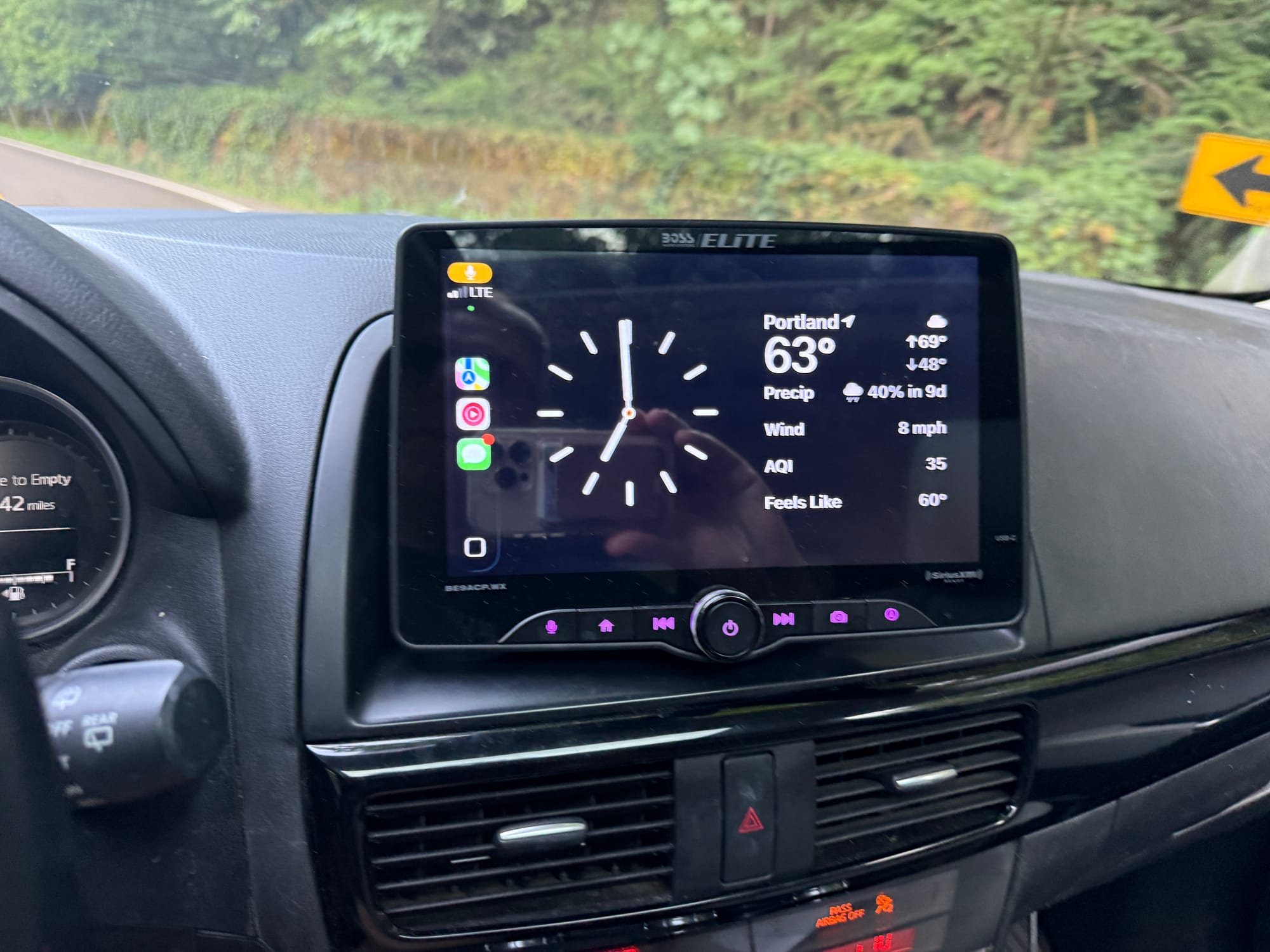
CarPlay
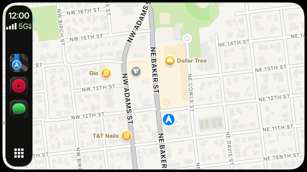
CarPlay has a bunch of nice little tweaks. You can customize icons as light, dark, or even clear. Maps now render full screen with menus and toolbars floating over maps.
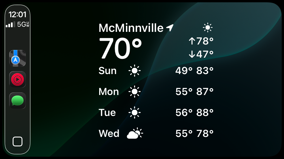
There are new widgets and I noticed once I even got sports scores on my CarPlay home screen during a game, which was nice. It's great to finally see Weather in CarPlay and I'm happy to see more HomeKit features appearing in CarPlay. With new HomeKit widgets you could run custom shortcuts much more easily as you drive home each night, to automatically open a garage, turn on some lights, and kick on your A/C.
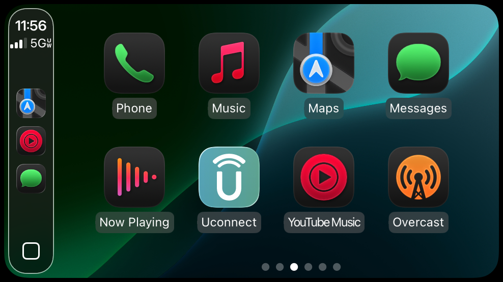
My biggest gripe with CarPlay is that horizontal screen space is most important to getting information on small screens in cars, and Apple really should follow the lead of Android Auto and move their app switching element from the left side to the bottom of the screen, giving more space to displaying apps side by side.
It's especially obnoxious on tall car touchscreens, as you sometimes see a really tiny cramped CarPlay view that's only 5" wide even though a car's physical screen can be over a foot tall.
Apple Watch
Not a ton of changes aside from some subtle interface tweaks and again, abysmal battery life. You really notice it on the watch, as my battery is hitting 50% gone by most early afternoons, when that usually took 12+ hours of wearing it before I'd see that on the previous WatchOS. I'm sure they'll fix that up by October.
Overall, I'm pretty happy with the new look and features though a lot of parts feel rough and in need of optimization. I haven't taken the plunge on my AppleTV devices but will after the public betas come out.