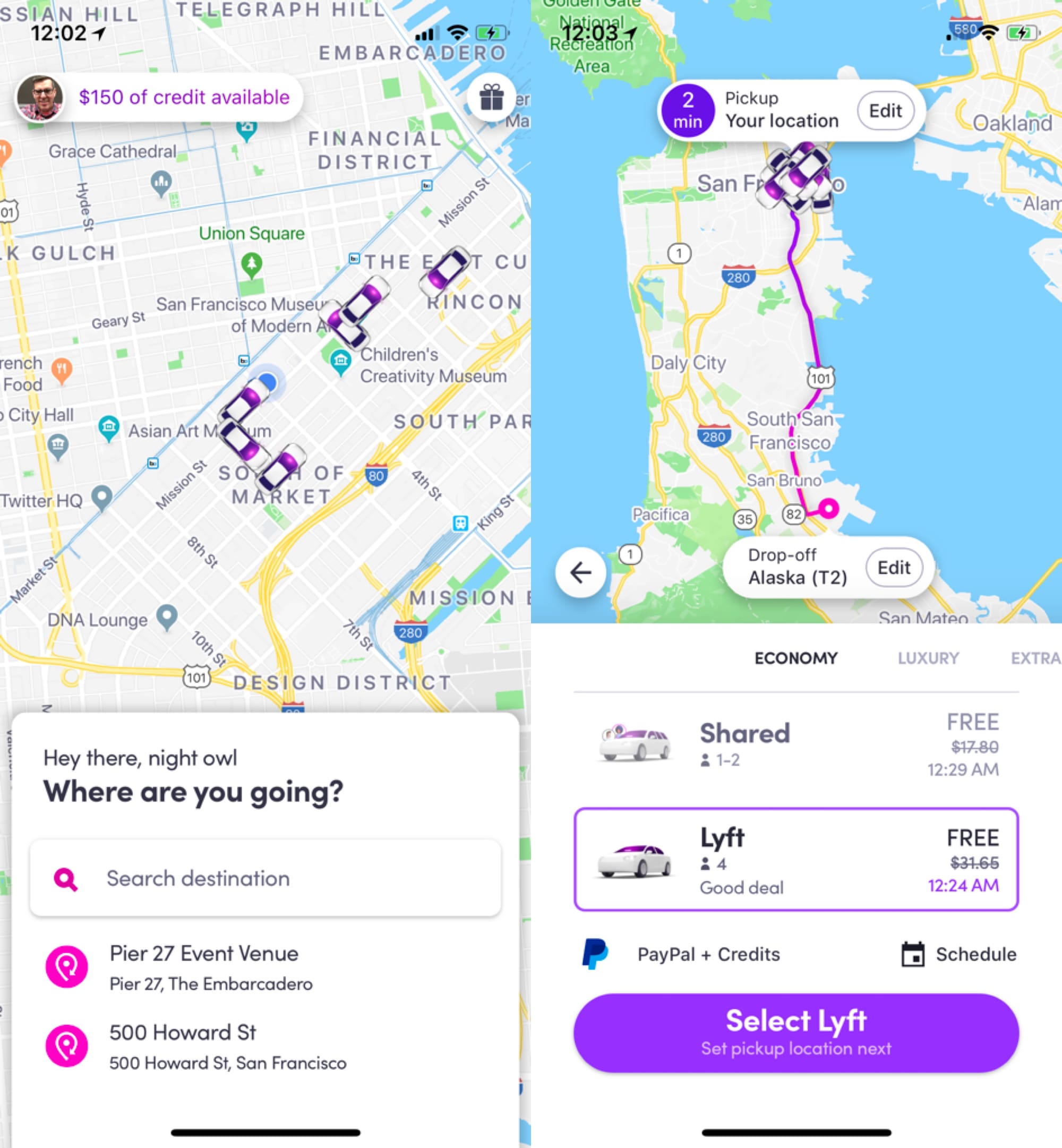
Lyft iOS redesign

I'm legitimately impressed with the recent Lyft app redesign on my iPhone. Somehow they collapsed the entire process of calling a car into just a couple screens, without making those screens feel overcrowded or overwhelming. On the contrary, the type is big and the copy is friendly and information is easy to gather at a glance. They're surfacing just the right amount of info at the right time.
It's a pleasure to use now, feels faster and easier, and it's one of the best refreshes I've seen in a phone app.


