Clever, thoughtful software design
A week or so ago, I quit Twitter for good. I did it in 2018 and it only lasted a couple months before I waded back in, but this time it's different. It was clear huge changes were coming to the platform with the new owner and although I've learned so much and heard different perspectives on Twitter, there was a large dark side to it that would only be getting bigger. So I downloaded my archive, used an auto-deleter, and started posting here instead.
A few days later, I figured I might as well fire up my old Mastodon account I hadn't touched in a few years. And what I found in the years since I've used it was a lot of clever little touches.
I don't really care about the federation part of Mastodon's network design and honestly I think most regular users don't either (and it's kinda goofy when you go to do something and you're asked to login to another server to complete it). What I do like about Mastodon is the person at the top of it seems very thoughtful and made conscious choices to try and make the software (and indirectly the community) a nicer place to be.
How to do accessibility right
One feature that jumped out at me as different between Twitter and Mastodon was writing alt-text descriptions for images to make your feed accessible to the visually impaired.
After 15 years of using Twitter, I only recently got an option that I had to turn on deep in my settings to give me the ability to write alt descriptions on images. Also, the process of using the feature isn't smooth, you have to remember to tap images and write one, or when you publish you get a giant popup saying you forgot to include the text and would you like to add it before publishing.
The way Twitter does it feels disciplinary, like a grade school teacher is admonishing you, wagging a finger because you forgot to do something you should have. After a couple times getting the popup I asked myself why did I enable a feature where the app yells at me?


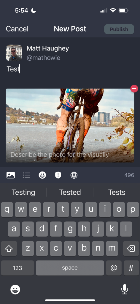
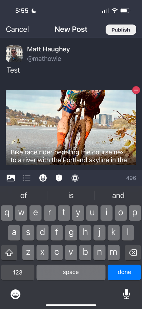
At Mastodon, you upload an image to a new post and there's some text that gently hints how to add a description and why you would do it. Adding it is easy, you tap the image and start typing while you're looking at it. And if you forget, the software doesn't punish you. Mastodon chose to politely nudge everyone to do the right thing by exposing the feature to every user automatically instead of requiring a preference setting then a nag screen.
Twitter had thousands of thoughtful, well-trained designers. But they designed a feature that was a pain to find and enable, then would feel hostile if you didn't use it correctly.
Mastodon is a big volunteer open source kind of thing with one guy at the top and hundreds of contributors and they decided to go with subtle, small hints auto-enabled and I've heard uptake of the feature is huge on Mastodon compared to Twitter as a result. It's a joy to add them there so I usually do it.
Many nice small things
A lot of what I like about Mastodon is seeing dozens of thoughtful little improvements that gently steer people to use software in better ways.
One big thing I like about Mastodon is that it doesn't allow for quote tweets by default. You can't grab a tweet, elevate it to your timeline and put a snarky couple sentences above it. The maintainer and designer of Mastodon mentions it's a deliberate choice to exclude it, that it promotes bad takes and pushes vile thoughts from others into everyone's timelines and puts distance between you the person who wrote it. Instead, you can reply to the poster directly, or boost it on your feed if you agree with it. I like that choice they've made here and the community feels less adversarial than Twitter as a result.
Another huge innovation at Mastodon is once you've made a new post and you invariably notice a small typo 30 seconds after you posted it, you can click a button to delete the post immediately, but put the same text into a new draft so you can fix it and post again. It's nice to be able to repost corrections with almost no effort, because they give you a one-click way to improve your own writing right after publication.
This feature was in Mastodon back in 2018 when I last used it. And Twitter never implemented anything like it, instead they just recently added a barely-working way to edit some tweets for a short period of time and only on paid accounts.
Mass migration
After leaving Twitter I told myself I would post on this blog pretty much everything I used to post on twitter, with a little more thought behind each tweet, because I no longer have to worry about character counts. But for catching up on friends, and posting dumb one-liner jokes, I find Mastodon to be perfectly fine for that kind of output.
It is fun and surprising to see many people I followed on Twitter escaping to Mastodon too. It feels like enough people showed up to a party that it's going to be a fun place to be for the next good while.
My daily reading now includes Mastodon combined with Feedly (for reading blogs) and I feel like I'm still getting much of the same news and thoughtful commentary I used to find at Twitter, but without Twitter. I feel like this change is sticking for good this time around.
Subscribe to get posts via email
Be the first to know - subscribe today


