Things that baffle me about Wordpress in 2018
So I'm back blogging! And I haven't used wordpress.com in ages, but I wanted to share my running list of WTF moments over the past week of using the site and service, both at work (we just moved our blog!) and here. I'm on the Premium plan, which includes CSS and custom templates stuff, but I don't get any plugins, so if your response to this post is "just use the xyz plugin!" it's not helpful. Full disclosure: I definitely have expectations after paying extra for the Premium option.
Submitting a comment to a moderated blog gives you no feedback
I turned comments on for <2 week old posts here, but I'm choosing to moderate every comment before posting. I notice a bunch of friends with Wordpress blogs do this as well, and it's fine to have to wait a few hours before a comment appears on the web.
What's not great is when you leave a comment and you get zero feedback. You type stuff, press post comment, and then… nothing. That's a bad experience and Wordpress by default should tell readers their comment was received and went into a moderation queue.
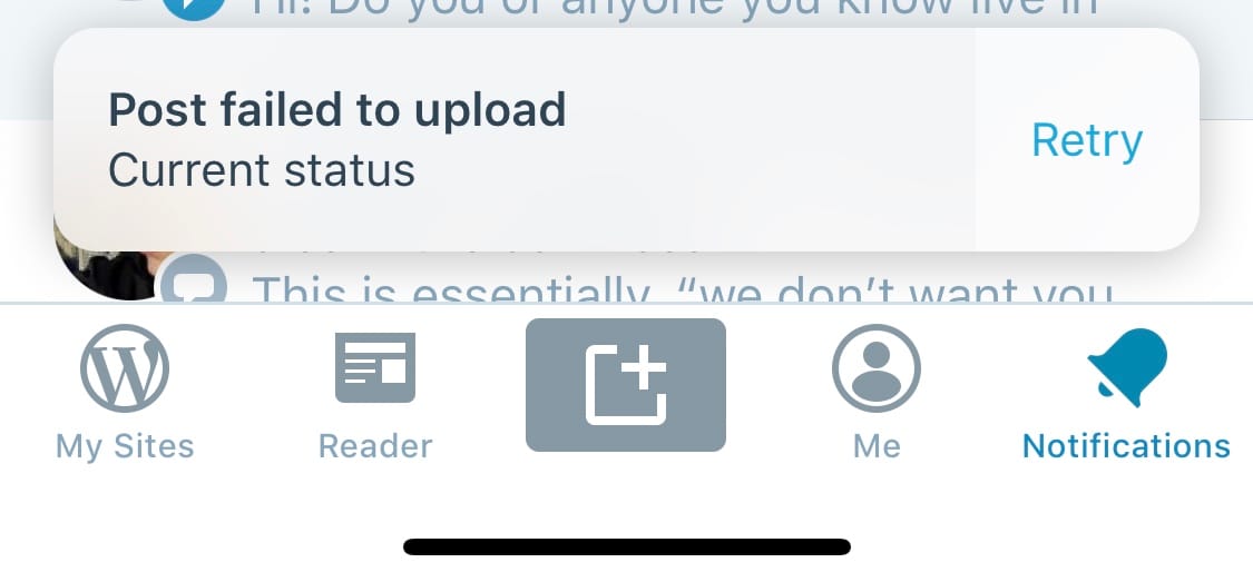
If a post fails to upload on iOS it disappears instead of going to drafts
Over the past week I've written a bunch of posts while out and about using the iOS Wordpress app, often with photos of things I was seeing. But unless I was on WiFi or had 5 bars of LTE connectivity, I would get a Posting Failed, Retry? message. The wild thing is even after hitting retry a bunch, it would still fail. And then if I flicked over to my draft posts folder, the post wasn't there. If I didn't keep retrying and instead clicked anywhere in the app, the post would disappear completely.
No drafts. No local cache. No local drafts folder to sync later. No opportunity to even get back to the edit screen! Just silent death, eating your post. After the third time it happened this week, I started remembering to copy/paste the post text to Apple Notes just in case it failed.
This is seriously a terrible bug and awful experience using the product and my current #1 peeve. In the basement of Pyra, when working on Blogger, I swear we had a cross-stitched thing on the wall that said Never silently eat people's posts with our app, ever and every so often if we found a bug in our code someone would say "Hey! Don't make me tap the sign again!"
Cookie details between accounts
I use Wordpress VIP at work under a separate email account login, and wordpress.com for my personal account with my personal email account. I run two profiles on Google Chrome, one work (Google Apps), one personal (Gmail.com account). When I login to the work VIP account on my work profile of Google Chrome, when viewing this blog, I see edit/login/write new post buttons. If I click them, they fail, but how on earth are cookie details being semi-shared between two accounts?
Is there no keystroke for adding a link?!
In a desktop web browser, using wordpress.com, the editor doesn't call out any keystrokes when mousing over buttons in the WYSIWYG toolbar. Is there really no keystroke for "I highlighted this text with my cursor, now build a link with the URL in my clipboard"? It's surprising that I have to leave the keyboard to make links on blog posts.
Paste and don't match style doesn't seem to exist on mobile. Also, why is Paste and Match Style even a thing?
I copied a bunch of text from wikipedia and pasted it in the iOS Wordpress client new posting form. It showed my text all styled like it was on the page I copied it from, with no obvious way to wipe out the styles. I want plain text in my blog posts, why is pasting clipboard text ever styled in Wordpress? Why not clean all pasted text so it displays in predictable ways in my blog's own design?
Highlight some text, hit the lists button, don't get lists
The Wordpress new post editing UI on a desktop browser seems to be lacking a bunch of things I've seen in many other editing UIs online. If you highlight a "stack" of six phrases in text, each on it's own line, then hit the unordered list or ordered list button in the toolbar, you don't get six items in an ordered or unordered list. You get all six as the first item. That's… not great.
The taxonomy of categories and tags, why not pick one instead of both?
This is likely an old timer complaint, but blogs started with categories on everything and original wordpress was wedded to that, then tags came in and a decade since anyone heard the word Technorati, my Wordpress posting UI seems to treat categories and tags as equally important, and it seems like a mess. Why not ask me to just pick one and go with it?
Burying links to Edit the post you are viewing
The Wordpress toolbar across the top has a Write new post button but if I'm viewing a single post at a permalink URL, and I spot a typo, I have to scroll all the way down to find the Edit Post link. Why not put that up in the toolbar where it's easier to spot and use?
What is an ampersand doing in the preview here?
This:

Lots of little polish missing on the WYSIWYG desktop browser posting UI
There are loads of little niceties missing for me in the new post UI. When I expand my list of categories and the find-as-you-type UI is at the top, why not put my cursor into it by default so I don't have to click to start typing? When I hit publish, why do I have to confirm it on mobile and desktop before it actually publishes? Why isn't hitting publish once enough? I'm not sure if I like the multi-device preview being the default when I'm on a desktop. I usually want to see a post live on my site asap. On mobile, seeing a new post in my site's UI is a bit of a pain, any clicks in the iOS app seem to push it into editing mode.
Overall, Wordpress is a fine tool, but given the age of the project and the vast number of people developing for it and helping shape it, I'm a little surprised to get flustered every few days using it this past week when it does something I didn't expect. Is it because there are only a couple of big paid blog CMS options at this point so competition is low?
Subscribe to our newsletter.
Be the first to know - subscribe today