A ranked list of all the 2024 NWSL soccer jersey/kits

The NWSL is the pro women's soccer league here in America, and I've followed it pretty closely since 2015 (2013 was their first season). In the early years, teams struggled to pay players more than a pittance and a few teams went belly up, but thanks to over a decade of growth, the NWSL is quickly looking like the next big billion dollar sports league.
I'm a huge fan of women's soccer because there's so little bullshit on the pitch. People sometimes dive, but it's nothing like the MLS men's game, where guys flop on the grass and grab their face in hopes of getting a free kick and/or card. The stakes are low and everyone just plays soccer pretty straight ahead in the NWSL.
I'm a fan but I also love typography and design, and every year I look forward to the slow random rollout of new kits from most teams. The good news is in 2024, Nike is behind the kits and today was the first league-wide launch of new kits for all 14 teams.
The great thing about being a fan of soccer is your favorite club usually gets a completely redesigned jersey each year. For superfans, owning each year's jersey is all part of the fun and something many look forward to. Contrast this with MLB or the NFL teams and their year-to-year changes are rarely drastic.
In the past, the NWSL usually had a new jersey for each team at the start of the year, but when COVID hit, teams slowed down to a new design only once every couple seasons and sometimes they'd debut them mid-season. The last few years gave fans nothing fun to buy and look at in the pre-season, and for the clubs, they didn't get another $100-200 annually from the new jerseys every fan wants to wear each year.
2024 is back, baby!
Every team debuted new Primary kits, Secondary kits, and on-field practice kits. I'm going to rank all the Primary/Secondary kits here for each team and give reasons for my scores. It's clear from looking across the league, some teams took it seriously and brought good ideas to the table while other teams just went with what looks like basic designs.
One new wrinkle worth noting is that the NWSL is moving away from Home/Away kits where the Home kit was colorful and your Away kit was always mostly white. This year there are Primary kits that seem to be most colorful with Secondary kits that aren't always white but can be quite colorful as well. For fans, this will make game days a little less predictable since your favorite team won't always play home games in their primary kit and vice versa, if the two teams playing have similar color schemes, one will wear a different kit.
What makes a good kit?
Good kits are tough to create and great kits are rare. A good jersey design has to do a lot of things at once including:
- Stand out from the pitch and against other team kits
- Be unique and fresh and not too derivative of other designs
- Have references to the city helps uniqueness and connects the design to fans
- Have good typography and sponsors with tastefully designed logos
Without further ado, here are my rankings for 2024.
#14 Washington Spirit
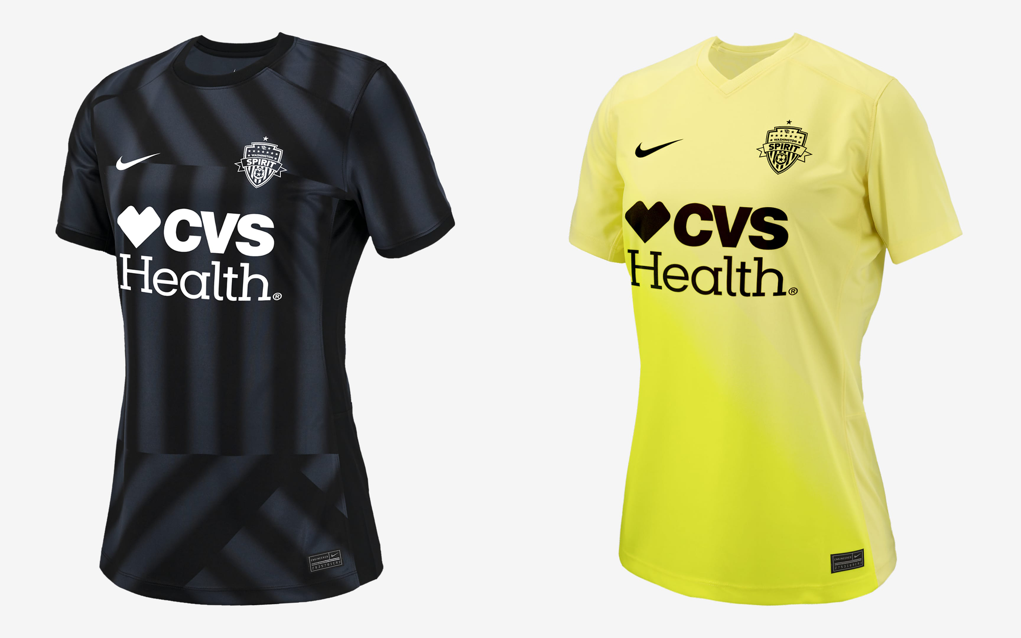
The Washington Spirit had boring jerseys for the last several seasons, but they have some of the best players in the league along with new ownership so I thought they'd come out of the gate swinging for 2024. Just imagine: you're the only Washington DC-based team, with all the history, colors, and iconography of our nation's capitol, but each year they play in solid color kits with a giant boring sponsor.
They could be doing some of the coolest mixes of red, white, and blue, stars and stripes, or riffs on famous buildings there and yet in 2024 their jersey is basically one color with all white logos.
Do something more inspired next time, Spirit. You have so much potential that you're just wasting here.
#13 Bay FC

The Bay FC team is a new expansion team playing in San Jose and bringing a women's soccer team to the Bay Area is long overdue. The region is home to some of the best women's college soccer teams on earth, not to mention a giant LGBTQA+ community that will support the heck out of any new sports team.
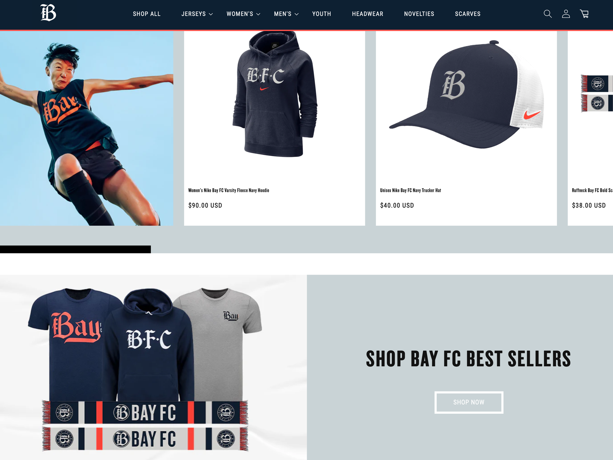
My problem with their launch year design is that it's completely uninspired and boring. Contrast that with the team's own line of gear that is loaded with personality and uses their new logo and blackletter fonts that resemble the New York Yankees. With the expressive, timeless designs on their merch I was expecting some color and patterns and maybe pinstripes on the Bay FC launch kit, but white and black really feels like phoning it in for the new club.
I get it though, there's a shit-ton of things to do when you launch a new expansion team, so I hope when they catch their breath after this season, then come out with something bold enough to match the team's energy in 2025.
#12 Seattle Reign
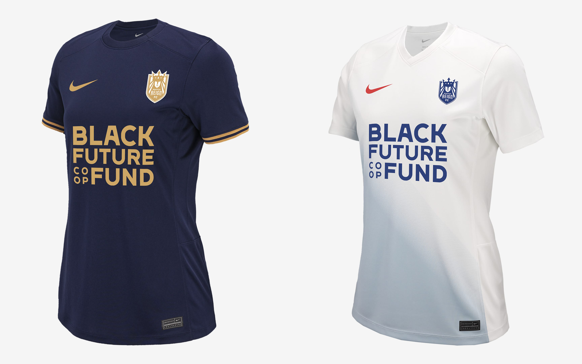
Seattle launched with the NWSL back in 2013 (using the hilarious punny name I still haven't grown tired of, Seattle Reign), but for the last 4-5 seasons they adopted a different owner's name and were only known as the OL Reign (which killed the pun and made no sense). Now they're back under new ownership as The Seattle Reign with a cool logo that screams Starbucks lady, but ancient and oceanic, so I thought this year would debut new looks to match the new/old team name.
Sadly, it looks like another couple of simple solids, again phoning it in levels of effort. The secondary kit looks almost exactly like last year's away kit, and the primary kit has nothing that screams Seattle at all in it.
What's surprising is that the NHL added a Seattle expansion team a couple years back and The Seattle Kraken have the best looking logo, jerseys, and apparel quite possibly in all sports. And yet, from the same city, we get a boring kit that if I had to connect to the area, I guess it reminds me of the cloudy, rainy days the region is known for?
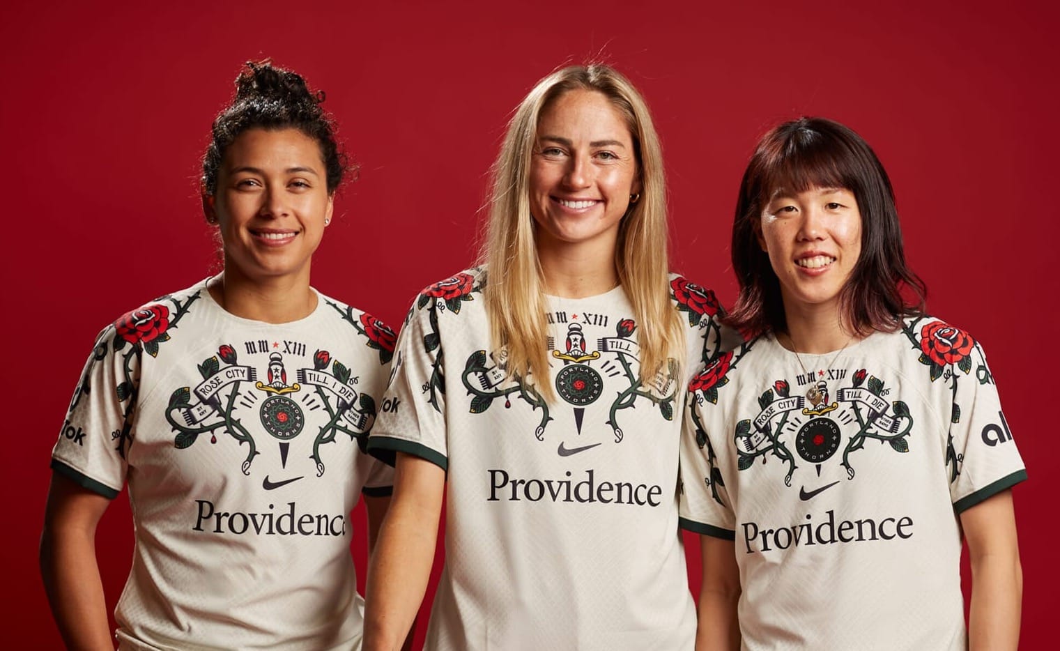
#11 Portland Thorns
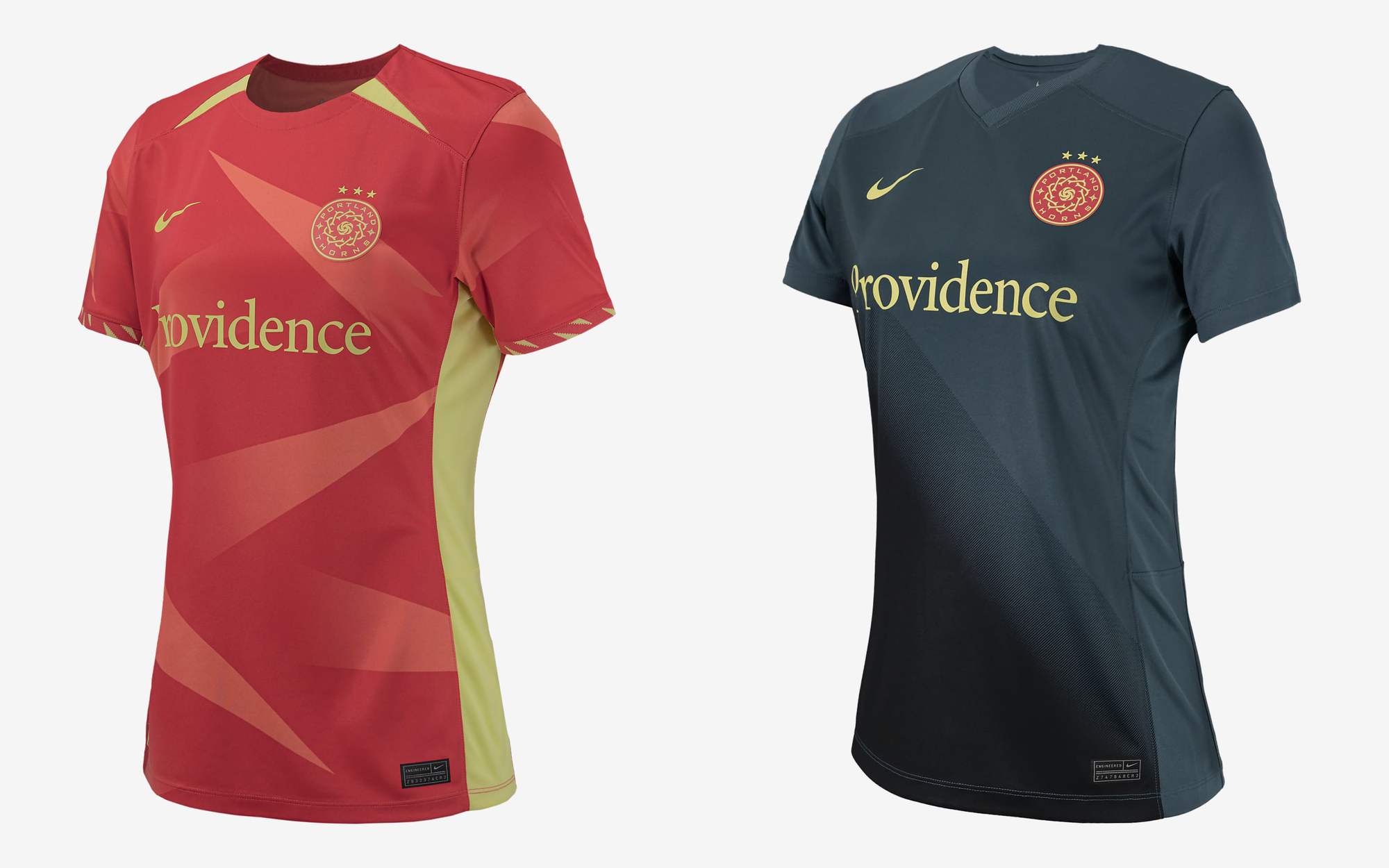
I've been a season ticket holder for the Portland Thorns going back to 2015, so it pains me to put my favorite home team so far down the list, but this year's kits are totally boring.
My all-time favorite Portland kit is their 2018 jersey, which riffed on all the previous years of red/black designs in a cool way that made them stand out on the pitch.

Last year's away kit—even though it looked like an Ed Hardy shirt from 2005—was at least interesting and I grew to like them enough to buy my own.
I don't know what the thinking was behind the 2024 kits, in previous seasons, the Thorns usually had a black/red main kit and this year's addition of yellow/gold makes no sense to me and doesn't seem to reference the Pacific Northwest. I can see they were going for stylized "thorns" like on a rose, but they're so abstract they read more as just random arrows. The secondary kit is understated but looks clean so they get points for that (I'll probably buy a secondary jersey).
Both lack any semblance of personality, which is weird because the Thorns have the highest average game attendance in the league and probably the largest women's soccer fan club on earth. The area is also home to many popular, talented designers that work with other sports teams, like Will Bryant, Kate Bingamam-Burt, Lisa Congdon, and Aaron Draplin, and yet, the club went with these very plain designs from Nike? It boggles my mind as a fan.
#10 Utah Royals
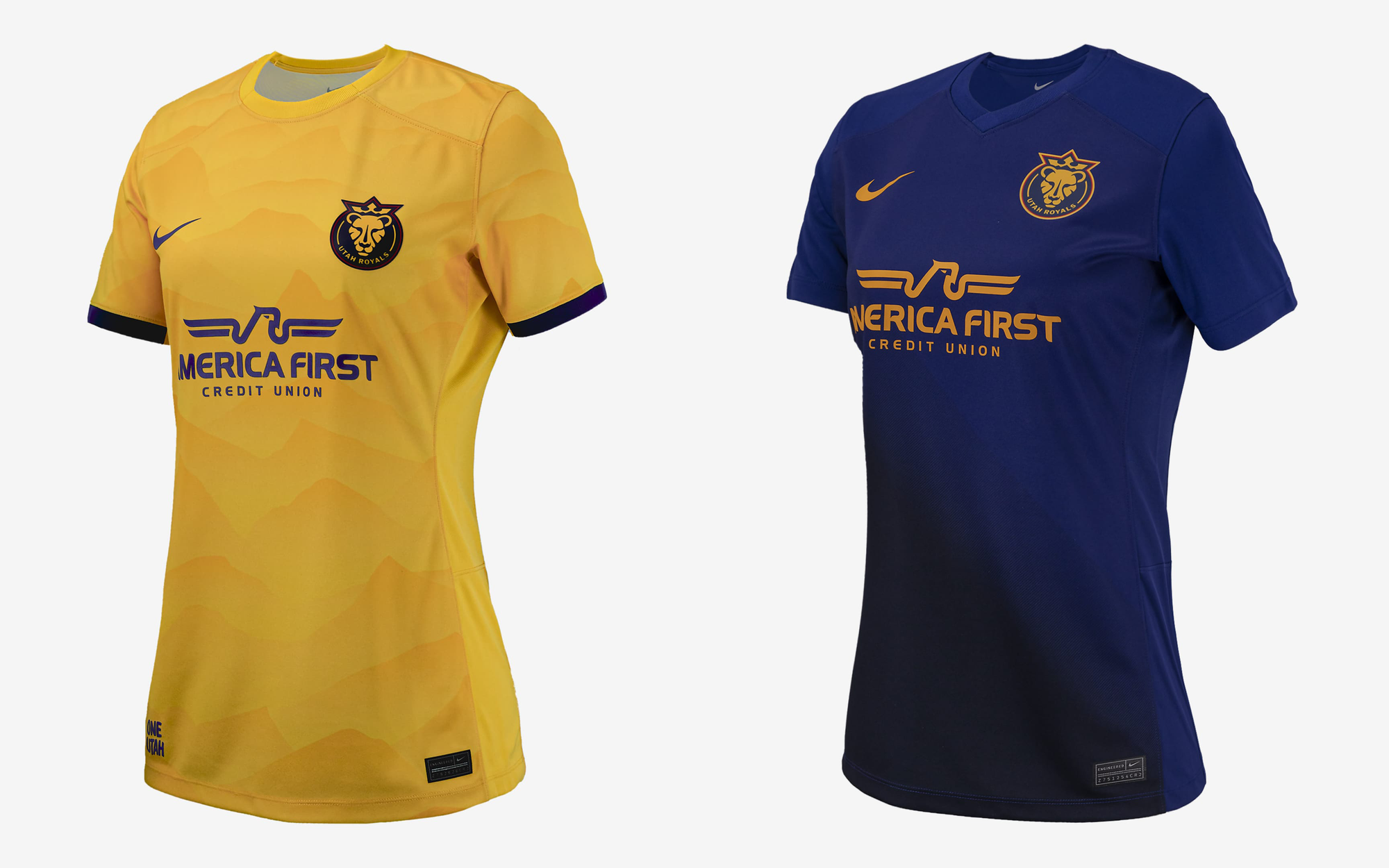
Utah is another new expansion team this year, though they did move the previous Utah team to Kansas City several seasons back. This year, they went back to their previous color scheme of loosely "royal" colors of gold and purple. Overall, this year's kit is pretty boring, with just a bit of texture on the primary kit. They're getting their sea legs again as a new club, so hopefully next year's kits will improve on these.
Oh, and the America First isn't tied to Donald Trump even though it was his slogan for years, it's just a credit union in Salt Lake City.
#9 North Carolina Courage

North Carolina has consistently been one of the top squads in the NWSL and in past seasons, they usually sported an understated, mostly navy jersey design.
I commend them for trying something new this year, though the primary kit doesn't break much new ground and looks like either last year's OL Reign home kit or carpeting you might find in a Chuck E. Cheese restaurant. It's an ok design, but I'd say the salmon-to-red ombré on the secondary kit is going to look super cool against green grass and makes up for it.
#8 Kansas City Current
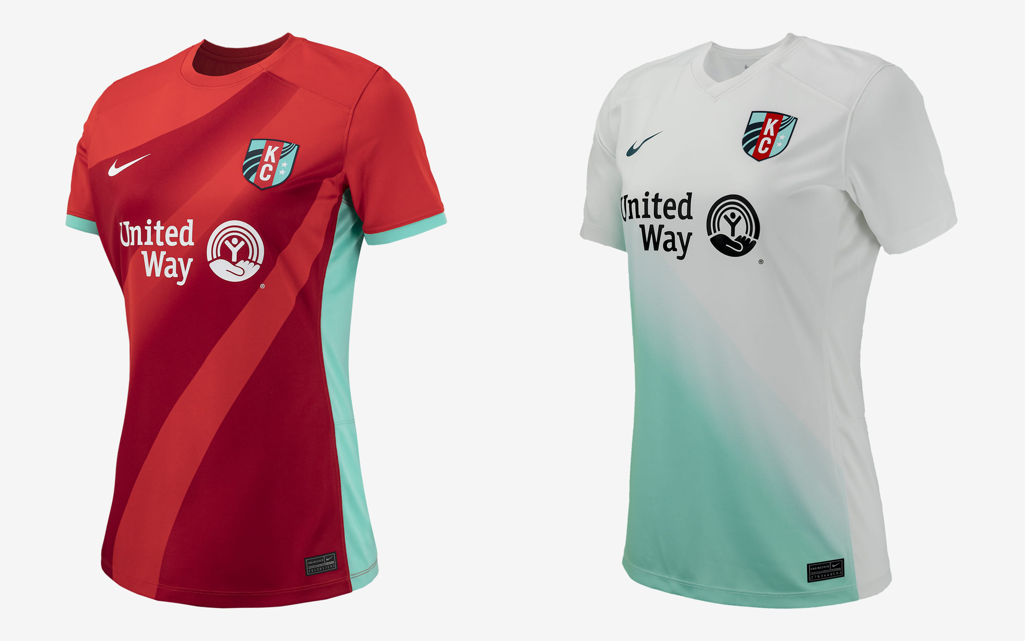
The Kansas City Current is kicking off the NWSL season in two weeks at their newly built stadium. It's the first dedicated sports stadium built solely for a women's team, ever built on earth, which is a very big deal.
This year's kits are an evolution of their past couple seasons, with the primary kit looking quite a lot like last year's, and the secondary keeping their "Teal Army" fan colors going.
#7 Angel City FC
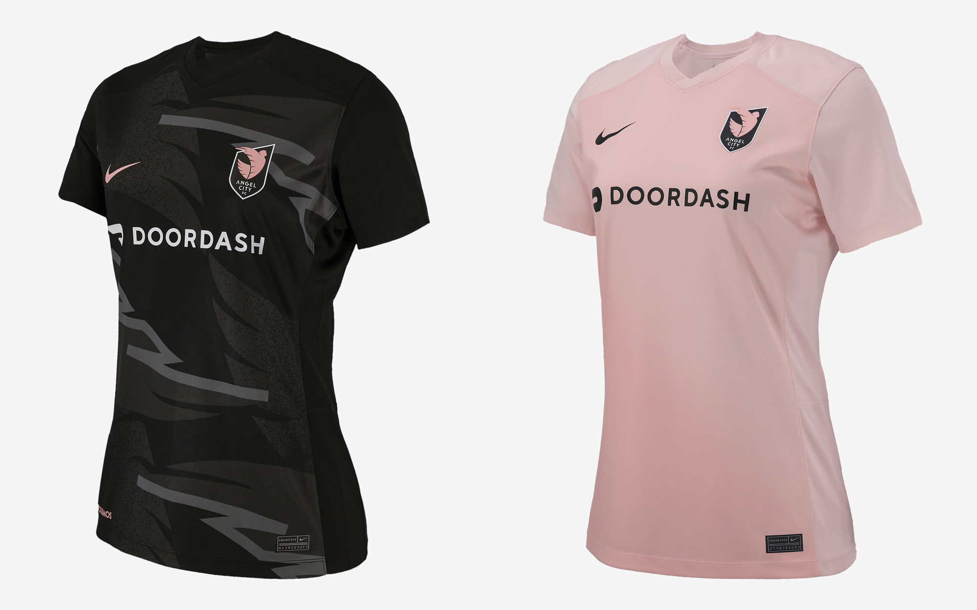
Angel City FC is only a few seasons old, but each year they've done some cool things with their kit in regards to patterns and designs. Their team colors are a combo of black and millennial pink that's unlike any other team so their stuff stands out in a good way. The 2024 kits have a bit of design and texture, but their previous kits packed a little more punch.
#6 Chicago Red Stars
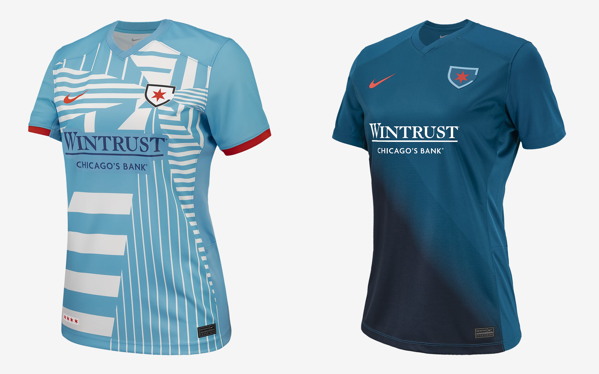
Chicago is getting points here for trying something new. They've had a fairly understated kit design for years, though I did love their previous kits that riffed on the Chicago city flag with four red stars across the chest. They went for something bold this year, but I'd have to say any team sponsor with a serifed font logo is going to be a strike against the looks. These are cool color combos and a good attempt at making something unique, but the sponsor holds the design back and makes it look dry and dated due to the boring bank font.
#5 Gotham FC

Gotham FC are out of New York City and since their rebrand a few seasons ago, they've always had cool kit designs and unique colors. Their 2024 kits are clean and distinctive and worth being high up on the list, even though I liked some of their previous kits a little more. I love the subtle nods to the NYC skyline and Statue of Liberty as their colors mimic the aged copper exterior of it.
#4 Houston Dash

Houston's 2024 kit is reminiscent of their previous ones, but like the Portland Thorns, they achieved near-perfection in a previous kit. Back in 2016 their kit design harkened back to my favorite MLB jersey of all time, the early 1980s Houston Astros and their "sunset" design.

It's tough to improve on previous greatness, but I think the 2024 kit is solid for Houston. The primary one reminds me of the city and the secondary continues their trend of using Houston's summer skies as an inspiration.
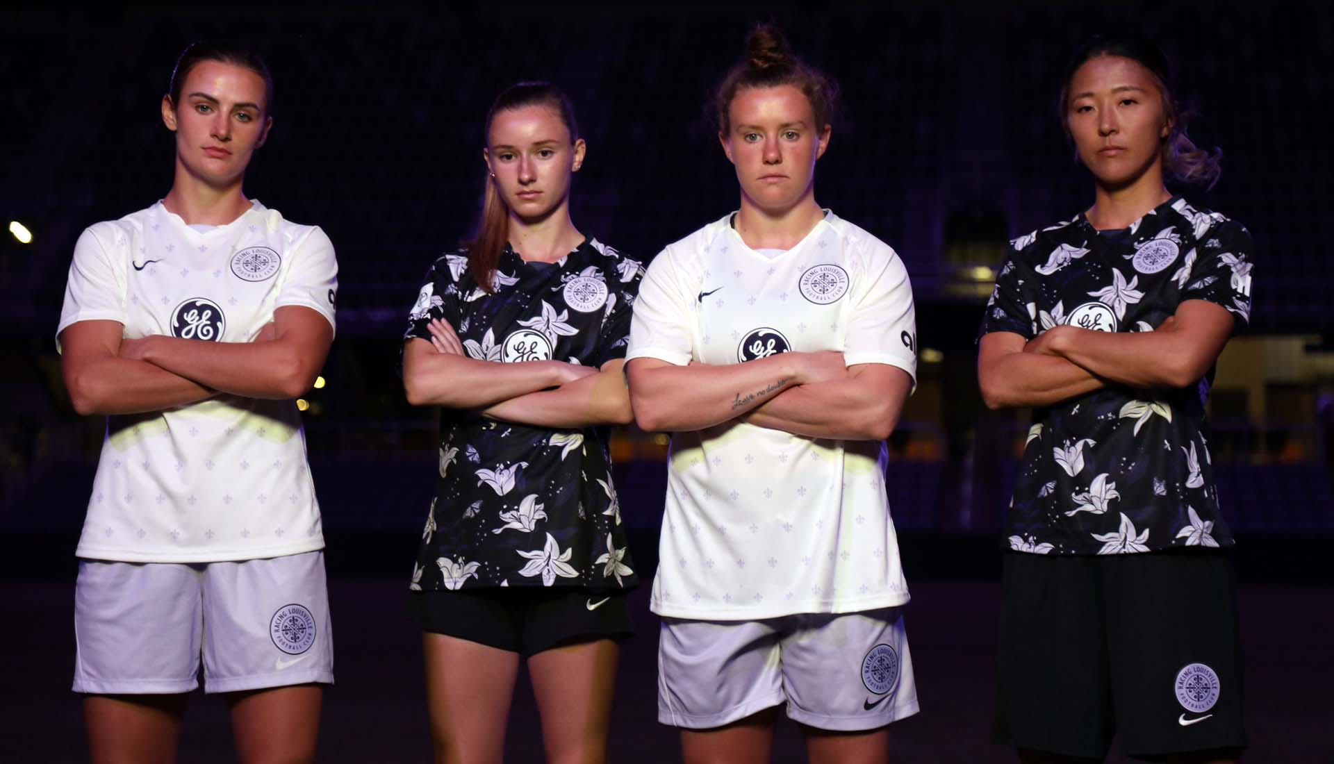
#3 Racing Louisville FC
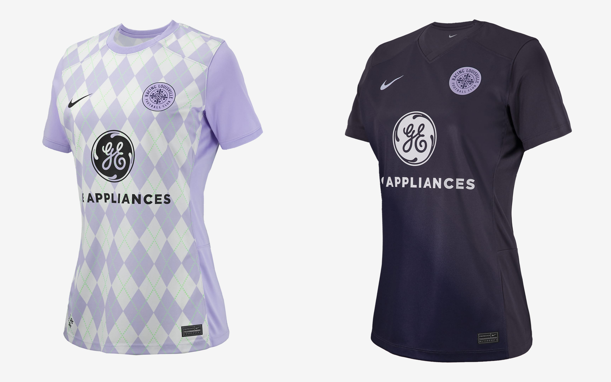
Racing Louisville is in their third season but their first jersey design with giant magnolia flowers all over was totally iconic, like nothing else in the league then or since.
Last year they replaced it with a more understated houndstooth black/purple design but I love the new lavender and aqua argyle, though I'd say it looks a little too much like a horse jockey's race day outfit. But it is cool to see Louisville always work local references into their designs, as not enough other teams do. The colors are cool as hell too. I wish the secondary kit had a little more zing to it though.
#2 Orlando Pride
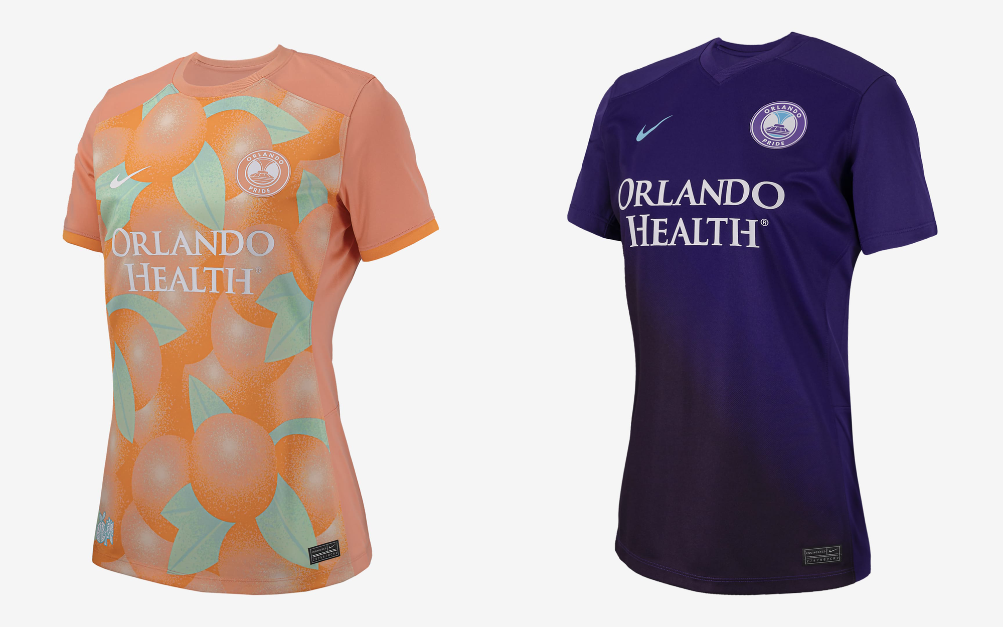
In past seasons, the Orlando Pride had a mostly purple kit, and they matched the MLS men's team they share a stadium with. Kudos for trying something new this season and going with a design covered in oranges to remind fans of the region's produce.
This new color combo is really going to pop on the pitch and set them apart as it doesn't look like any other team kit. The secondary jersey is kind of clever in that it matches their previous years so much so that if you wore an older season jersey to the game, barely anyone would notice.
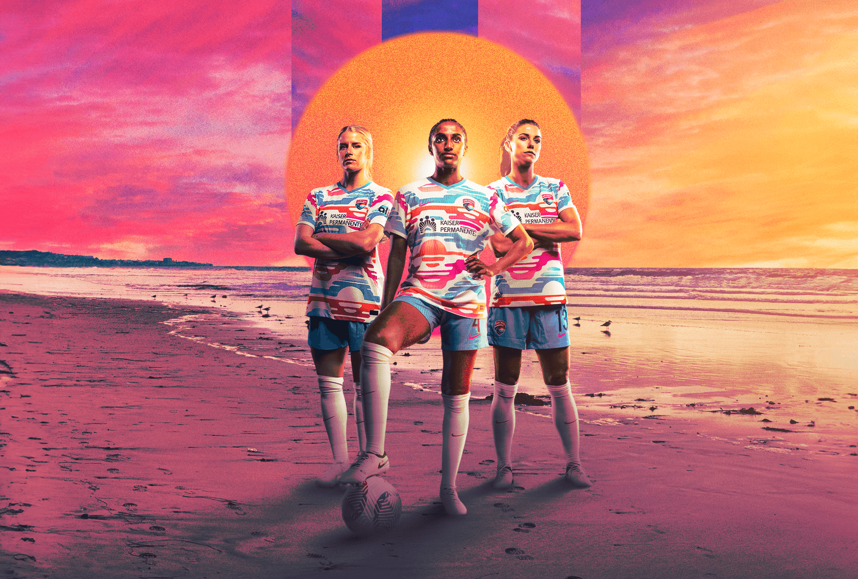
#1 San Diego Wave FC
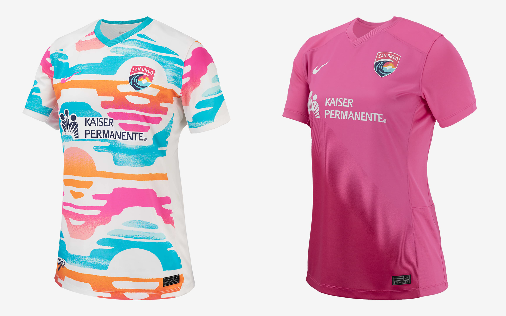
Let me say upfront that the first time I laid eyes on the new Wave jersey this morning, I thought I was looking at a Taco Bell burrito wrapper from 1988. But it's bold and cool and makes a statement, and looks incredible on the team in full kit (see the featured image at the top of this post). They won't look like anyone else when playing games and the players will really pop against green grass.
I love that San Diego referenced Latinx and native colors and culture—for a team that's only 20 minutes from the US/Mexico border it's a natural fit. I love the secondary design as well, as the team had been training for years in all-pink kits.
San Diego has only been around as a team for a couple seasons and their merch is always so incredibly fun and vibrant, but the team's previous kits were mostly understated plain navy shirts. I'm glad to see them embrace the fun and a bit of the weird this year and they're definitely at the top of the league when it comes to kit designs.