I designed my own Ghost theme *from scratch* (with help)

It's been about two years since I exported my blog from a hosted Wordpress install to Ghost Pro and one aspect that never quite sat well with me was the lack of great template designs. Back around 2010, I gave up on creating all my own templates from scratch in photoshop and HTML, because back then CSS and mobile-friendly frameworks became so good that you suddenly had dozens of great, flexible designs you could build off of.
I suspect Ghost's template language is a little finicky and their build/deploy process is unusual, so it probably keeps most designers away. The default free templates from Ghost are good but it's pretty hard to locate more indie-developed, blog-focused designs. I've searched all over for the past two years and I've even paid up to $100 for Ghost templates I liked, but once deployed on my own writing, I'd find bug after bug (most theme designers are good about fixing them) but I'd always want tweaks that usually only suited my needs.
The beginnings
I started with some mockups around a text-heavy layout that also features my photographs prominently, and it had to use soft colors. I tried a few directions then asked Claude Design to try and come up with some ideas and tweaked on the one I liked the most.
I started with a homepage design that is just a bunch of featured images and excerpts that link to the blog posts. I added some variety so the homepage isn't just a giant grid.
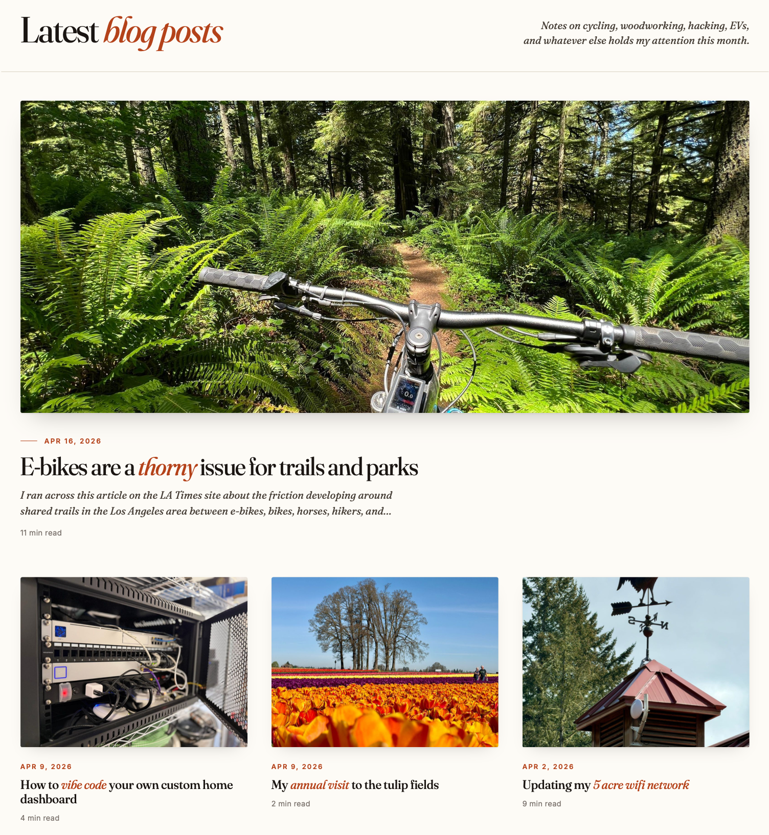
Then I focused on the single blog post page. It had to be comfortable to read, so the line length isn't too wide, but images are displayed widely, as are photo galleries and YouTube video players.
Then the top needed a sticky nav and then a footer that complimented the page. To get into Ghost's theme system, I had Claude Code convert the mockups into working ghost templates. I spun up a ghost staging server on my home network with my posts restored from backup so I could test out dozens of small tweaks, but after a bunch of iterations when it got to a good place I went ahead and uploaded it to this live site.
Stuff I really like that I couldn't find anywhere else and had to make
Ghost is a blogging engine, but it's used for all sorts of sites and for some reason none of the default templates (or even ones you can buy) have a good solution for presenting deep, old archives to the reader.
I know I'm an outlier because I have almost 3,700 posts while most blogs are set up to show you 20 posts per page with pagination in the footer to let you get to everything. But with thousands of posts I need a date-based, quite compact view for flying through the past in a hurry and I like the one I developed over a bunch of iterations.
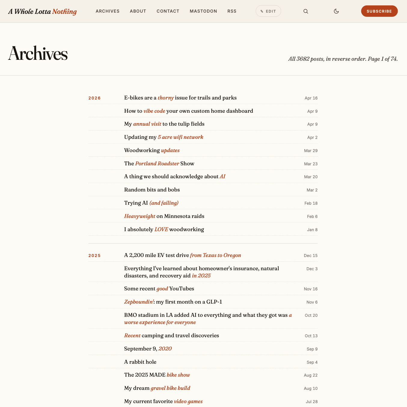
It's a year-by-year, at-a-glance look that is easy to scroll through so you can see multiple years on the same page, currently showing 50 posts at a time. You can also use the search icon in the nav to locate stuff using Ghost's native search box (which I don't love and might be my next project)
The other big feature I always wanted in Ghost but it never had was an edit button for the author when viewing their own entries.
I get why Ghost never developed this; my blog is located on my custom domain name, but my ghost admin cookies are from another server. But I wanted to find a way to fix this because whenever I review my own blog post after publishing, I always spot at least one small typo.
Now, the Ghost-approved shortcut is to type /edit on the end of any existing blog URL in your address bar, then Ghost loads your admin UI with that post in it and you can fix any typo. But I always wanted a button on my template that only I could see and now I have that:

I set a custom admin cookie for myself to toggle the button for just me, so now I get one-click access to fix typos as I spot them. I know I already love this feature because I've used it 40 times in the last 24 hours.
The last tweaks to the template were adding light and dark modes, then more Ghost native features like image light boxes for galleries when you click on images to see them larger, the subtle email subscription option in the corner, and making sure every feature still works on mobile layouts.
I decided to go with a serif body font for easy readability and a book-like look for the pages, but I wasn't completely sold on it until I stumbled onto a old post with an ampersand in it. I was immediately hooked, that ampersand is to die for.
Stuff I'm still tweaking/not-sure-of
I like the subtle red accents on titles to break up the text, but those require me to put markdown asterisks in my titles and those do appear in RSS feeds. I know you should never tweak content for presentation reasons but honestly I don't mind it as the emphasis is meant to highlight some aspect of the title.
I've gone back and redone tags and featured images and added accents in titles for the past couple years of blog posts but I eventually need to work through the rest. For years, I ignored tagging my posts and now I wish I stuck with it. I'll probably have to build a small tool to help speed up the process of doing each entry one by one.
If you spot anything weird or missing, feel free to reach out to me via email in the nav or reply on mastodon and I'll do my best to patch things up.
Bottom line
The good news if you're a Ghost user, Claude is very good at understanding the subtleties of Ghost APIs and anything you can mock up as a static image can be turned into a full-on Ghost theme in about a day by it.